Why Fairground?
For us design isn’t just functional, it’s also fun.
A Fairground is a place people can relate to, it’s nostalgic, familiar and provokes a literal roller coaster of emotion. We experience these same emotions of happiness, excitement and fear in our industry, all of which are driving factors that help us develop as a company. By stepping out of our comfort zone it allows us to learn and grow.
A Fairground is also a place of fun and playfulness. We don’t take ourselves too seriously and like to push the boundaries of creativity. This is a true reflection of our values.
We think BIG and small
For us it is as much about the BIG picture as it is the finishing touches. We are deeply passionate about providing our clients with real value. That is why we believe in having a rigorous process accompanied by unrestrictive creative freedom.
Having a beautiful brand or website is a great start but the real value comes with a solid future plan and a strategy to back it up. By creating a messaging framework that truly resonates and understands its target audience, templating consistent future assets and evolving the brand over time, we ensure that we are remaining relevant to our audience.
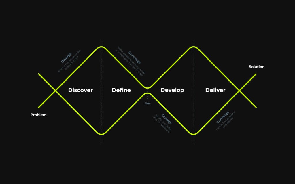
Purpose, mission, vision
We are a branding and digital studio that creates, shapes and elevates brands. A team that puts people at the heart of everything we do. Creating the best work of our careers by delivering valuable creative experiences.
Our goal is to provide you with outstanding, crafted and beautiful work. We strive for quality and consistent delivery, on-time and on budget. Exceeding our clients expectations by providing an extension of their team. We are a place where creativity thrives and reward is based on merit and initiative.
Our studio is a fully immersive and engaging environment where talented, open-minded, hardworking individuals want to work and thrive together.
Brand personality
- Transparent and friendly
- Flexible and ambitious
- Intuitive and innovative
- Fresh and clean
- Informed and down to earth
- Methodical and direct
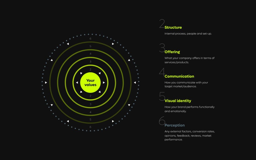
“For us it is as much about the BIG picture as it is the finishing touches. We are deeply passionate about providing our clients with real value.
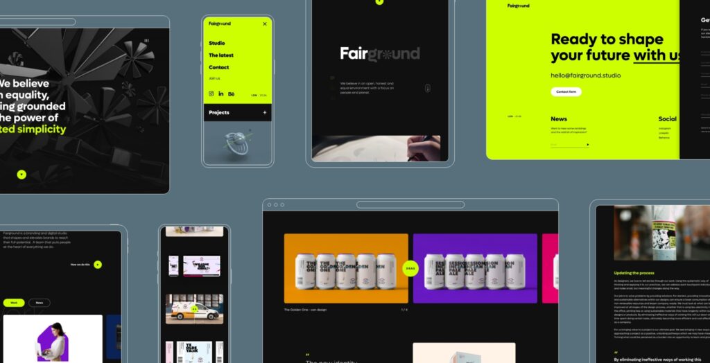
Brand inspiration
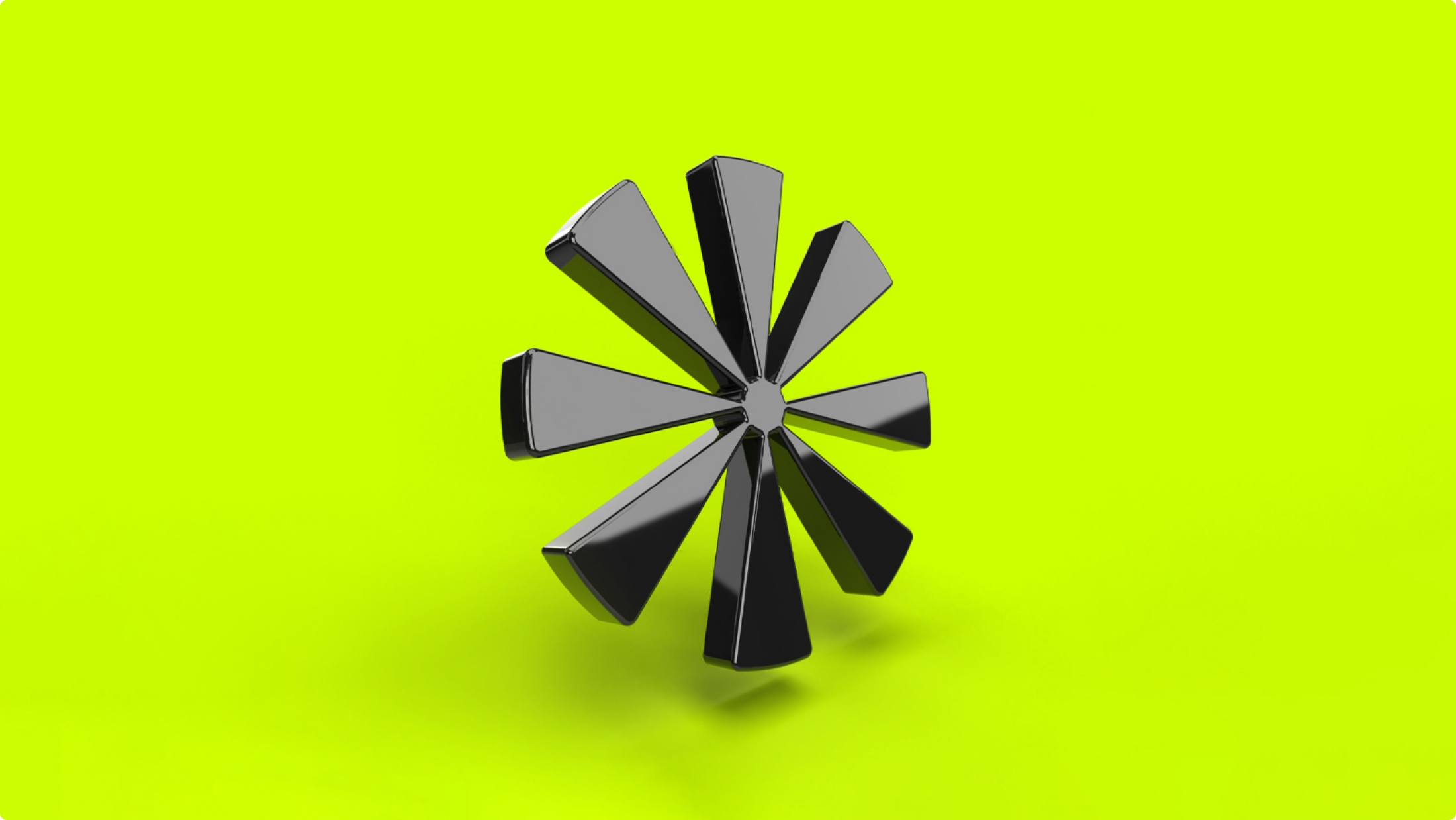
Each element of our brand has been carefully considered. For example the font Lufga is our brand font because it has crisp clean lines and has just enough playfulness in some of its forms, particularly the letter ‘g’. Our brand mark was inspired by a big-top tent, carousels and the ferris wheel. These rides and attractions give our brandmark its personality and flexibility, especially when in motion. Our colour palette represents our personalities; bold, ambitious and vibrant with a neutral grounding backdrop that balances out the palette.
All of the elements of our brand are able to work independently, but once brought together create a stronger more coherent visual and form a deeper rational. Every brand story is different and this is a small snippet of ours.
What we offer
As designers, we love to tell stories through our work.
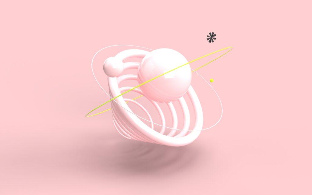
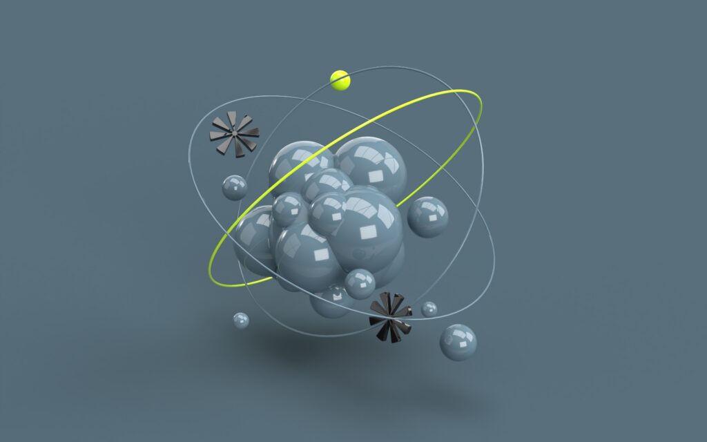
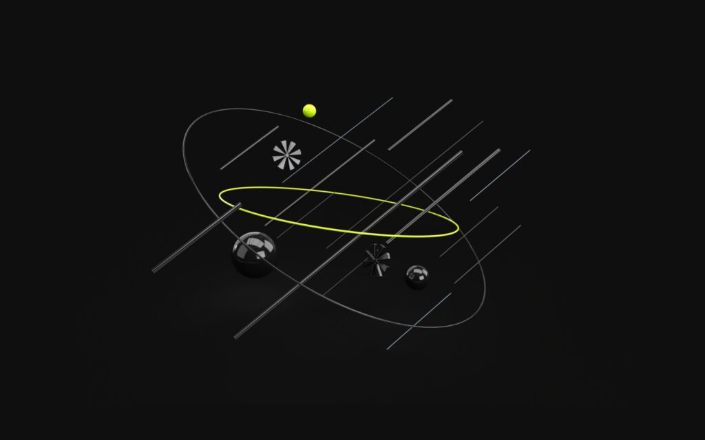
We have broken down our offerings into three core areas, strategy, creative and digital. All of these areas overlap in some way but we see them as very different disciplines. By listening carefully to the problems our clients face and collaborating in an open way, we are able to create tailored solutions.
To see a full breakdown of our offering or to talk to us about a project please feel free to download our extended offerings presentation or contact us using the links below.
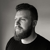
Problem solver and a thinker. Conceptual at heart with a meticulous eye for detail. I specialise in adding value through thoughtful, considered design and crafted simplicity.

