Lofted
Task
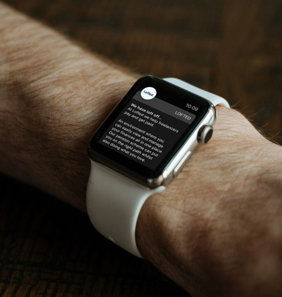
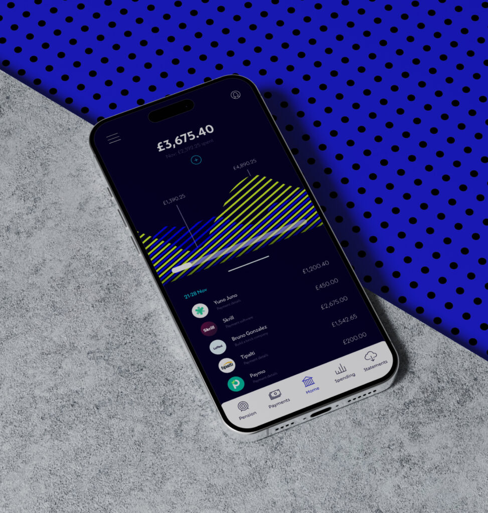
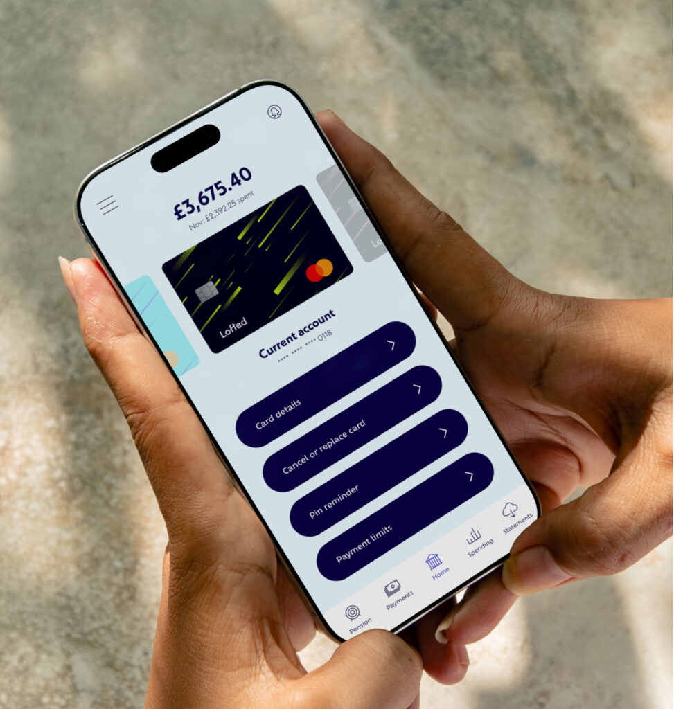
To create a banking app that is primarily used by freelancers to keep track of payments coming in from multiple different sources. Creating a simplified link between real-time finances, pensions and savings.
Journey
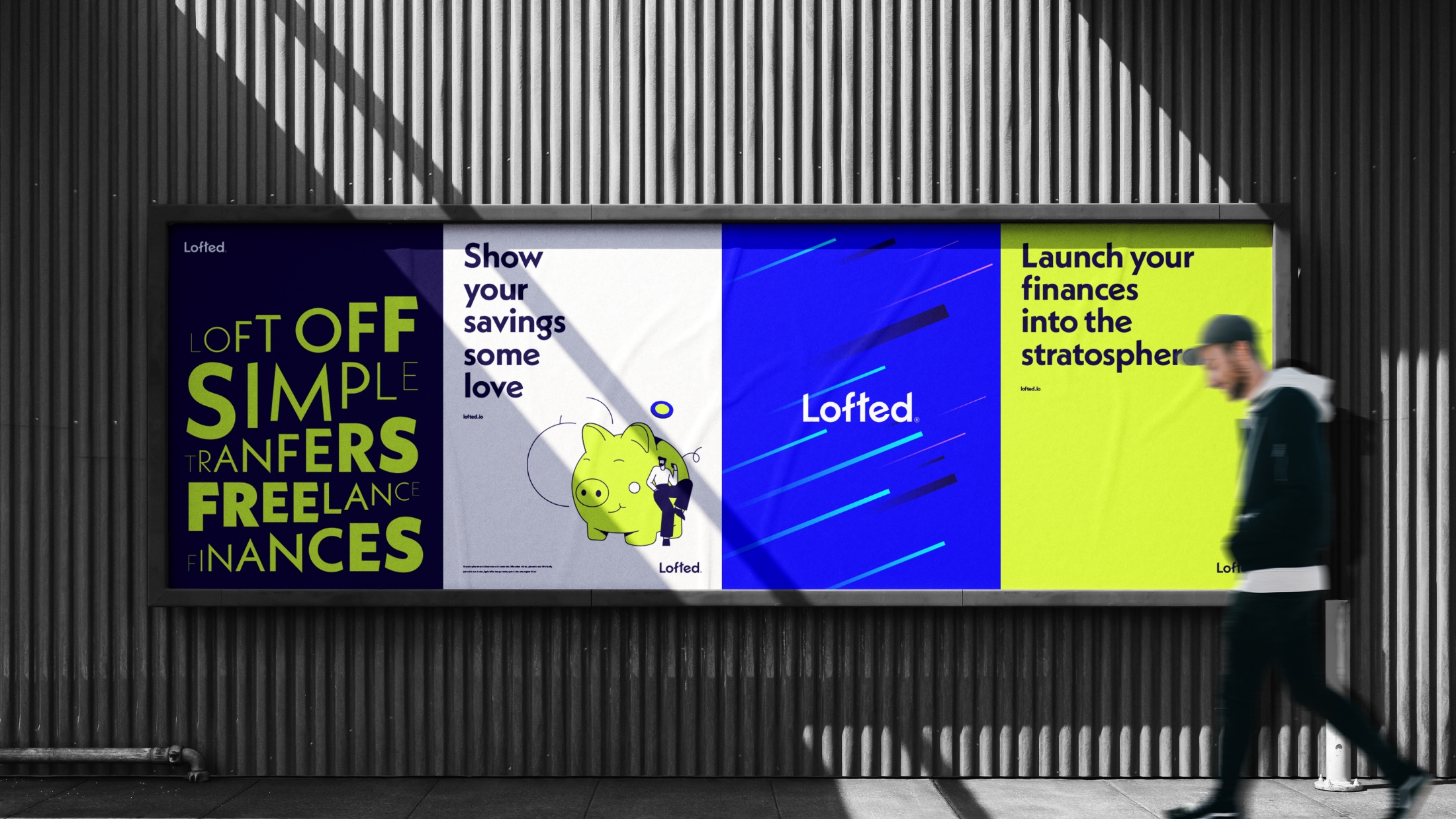
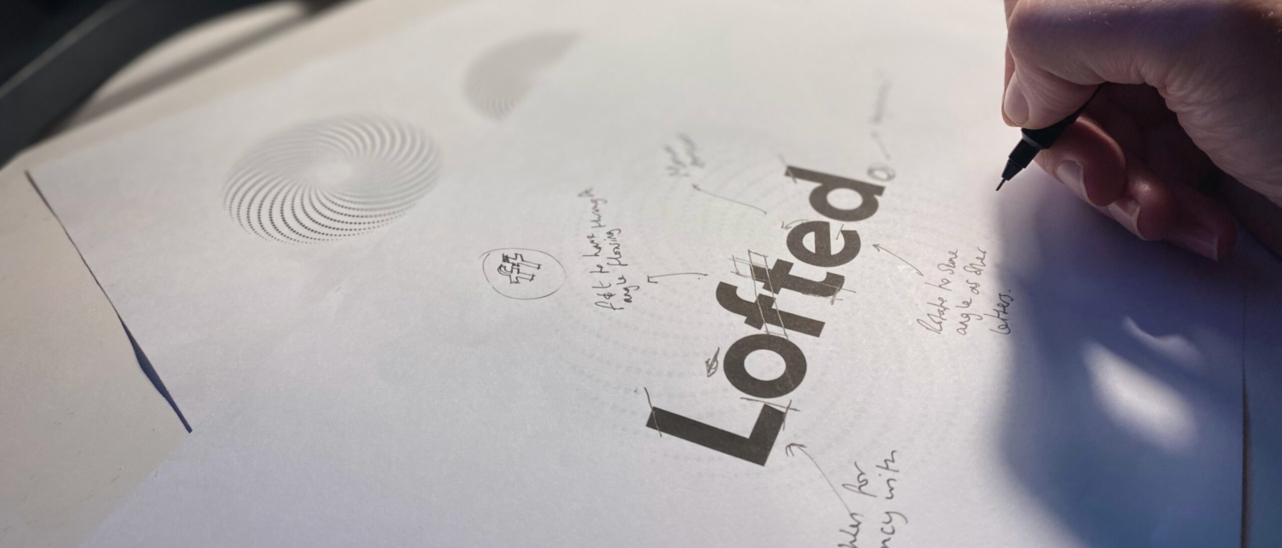
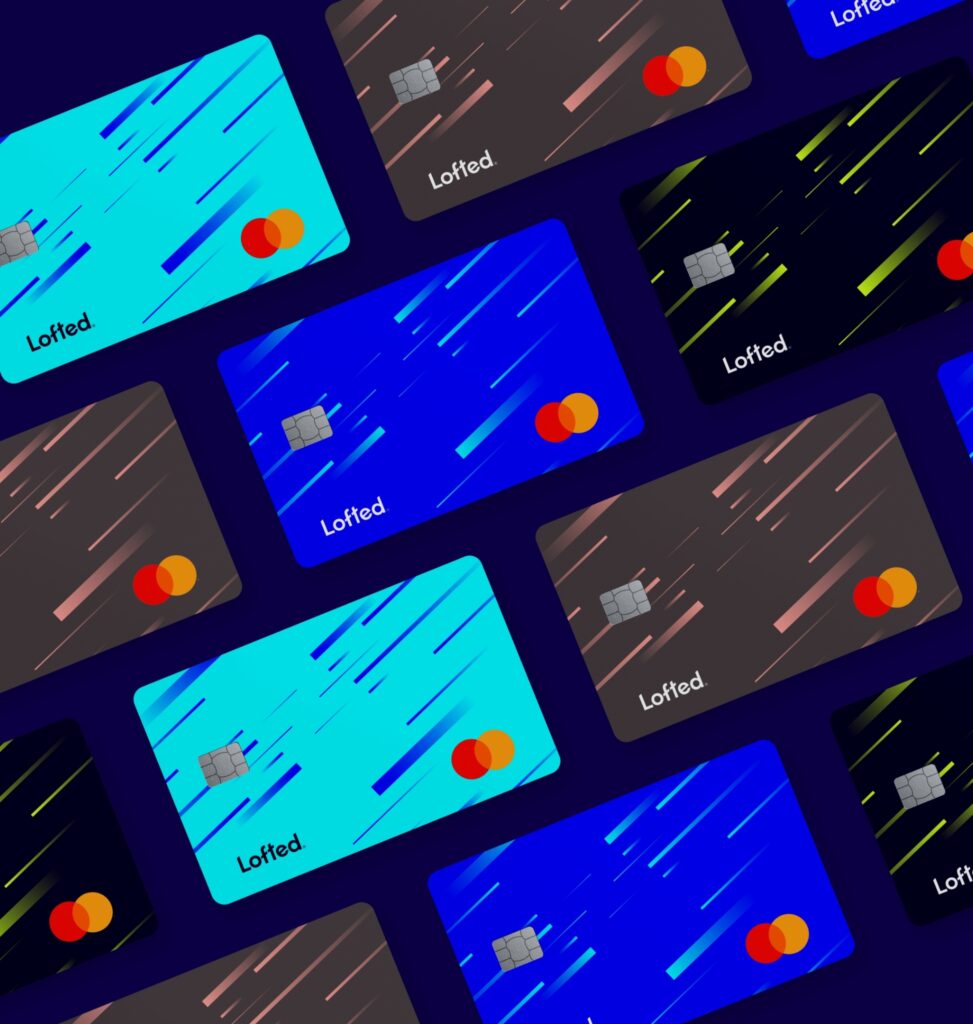
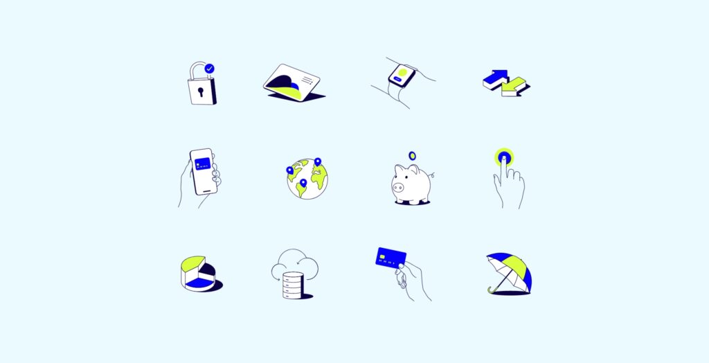
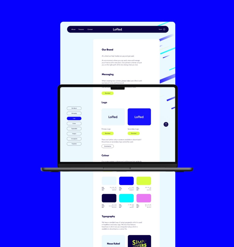
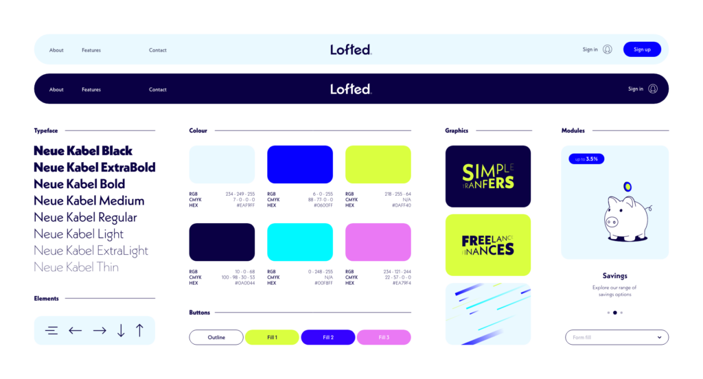
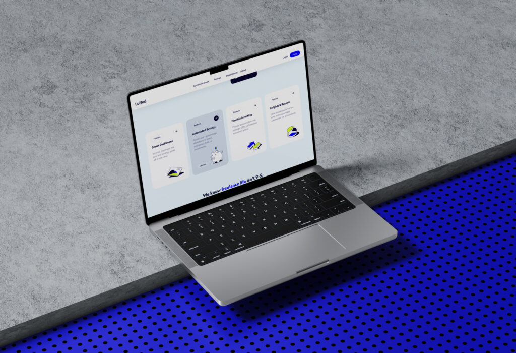
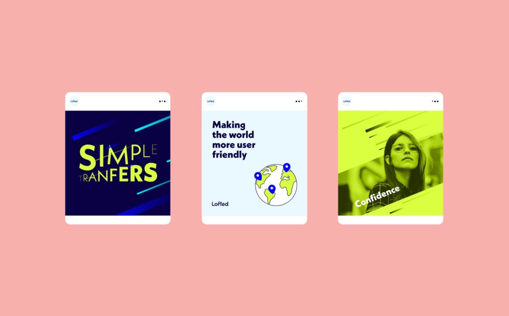
As the clients values are about being positive and uplifting we created a brand language that focuses purely on this type of energy. Everything about the visual and messaging is vibrant, snappy and optimistic. From the wordmark and colour palette through to the visual language. It is bold, confident and engaging. Industry appropriate and user friendly but on the side of disruptive.
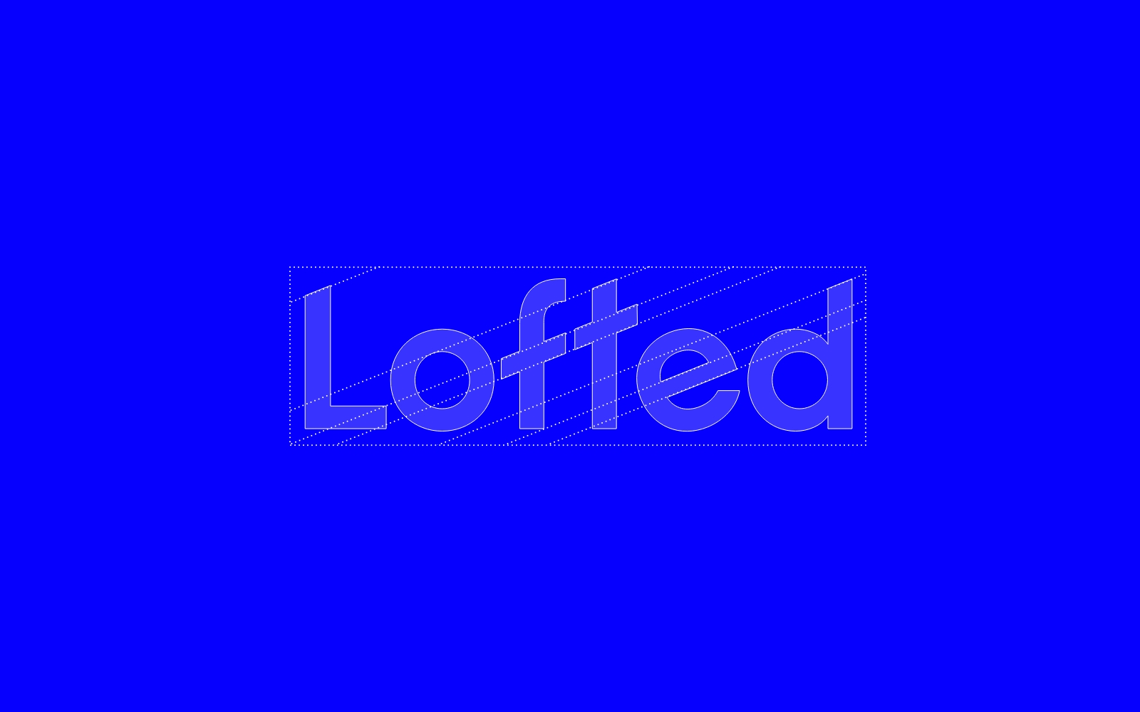
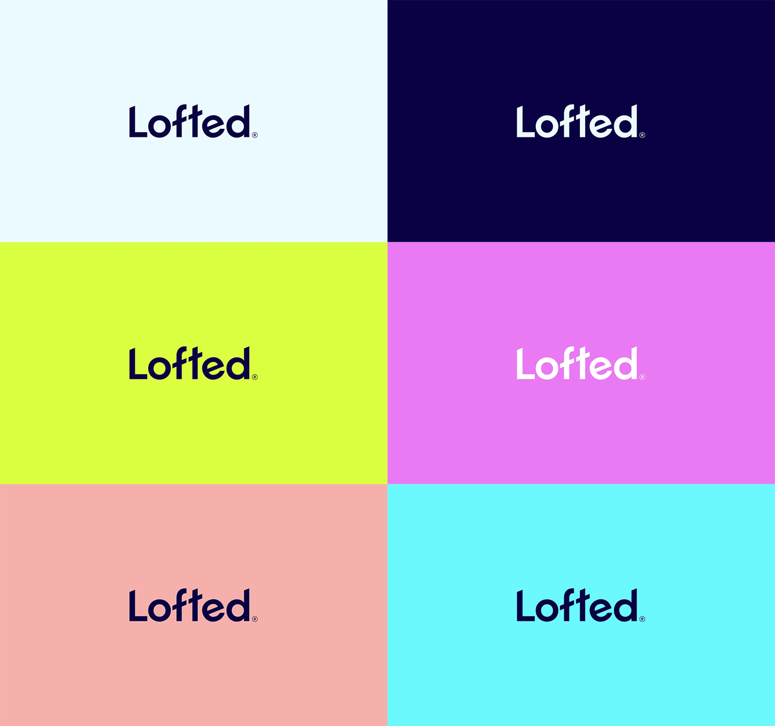 Wordmark
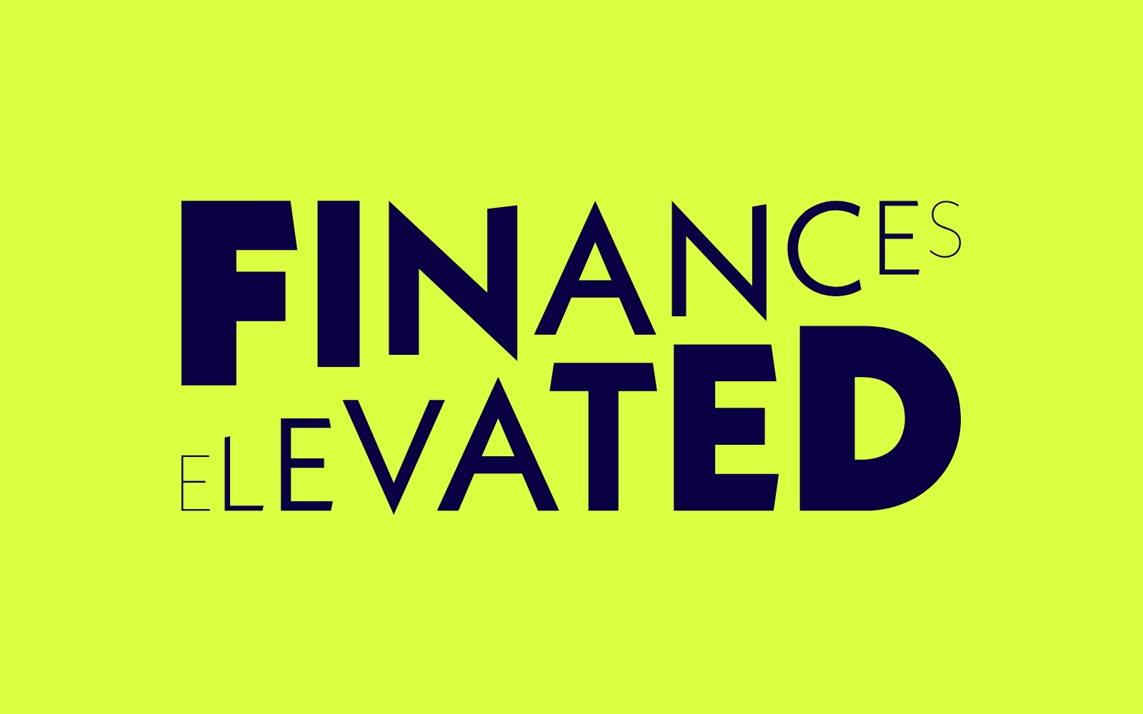 Styled Type
 Colour Palette
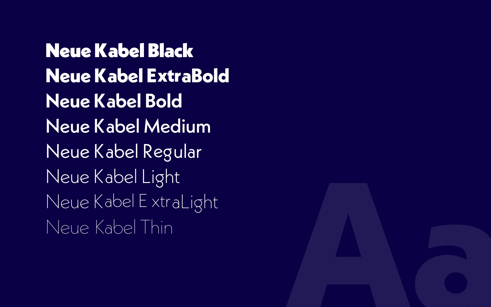 Typography
“ The positive rationale really resonated with where we want to position Lofted in the finance space. The boldness of the typographic execution is stand-out and we love how the elements all come together to create a unique but familiar user experience in our industry.


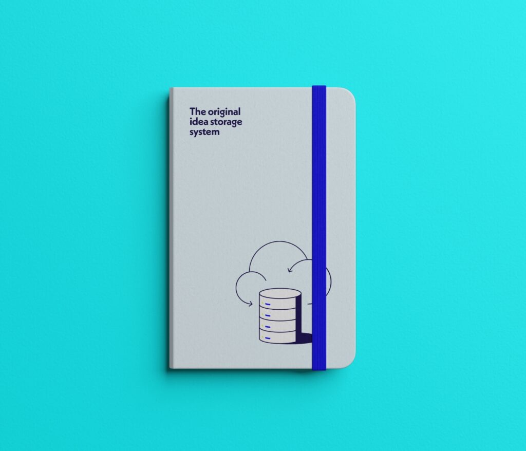
Notebook
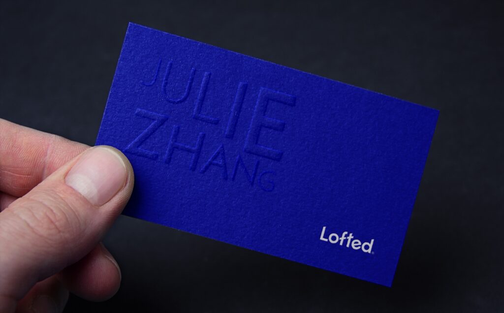
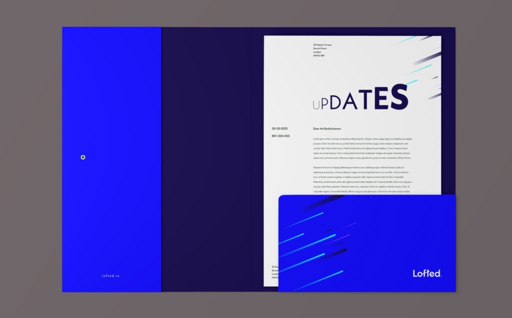
As part of the project scope we created a number of marketing pieces. These included stationery, apparel and various merchandise. These would be used to promote Lofted internally and externally.
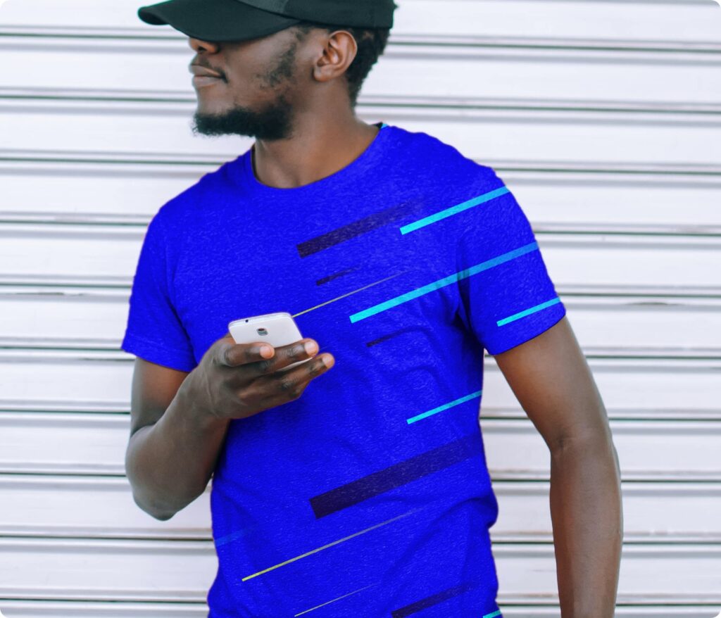
Lofted apparel
We used the trails graphic across the apparel as it is striking, bold and distinctive. They were available in multiple colour combinations and each design had a bespoke trail graphic.
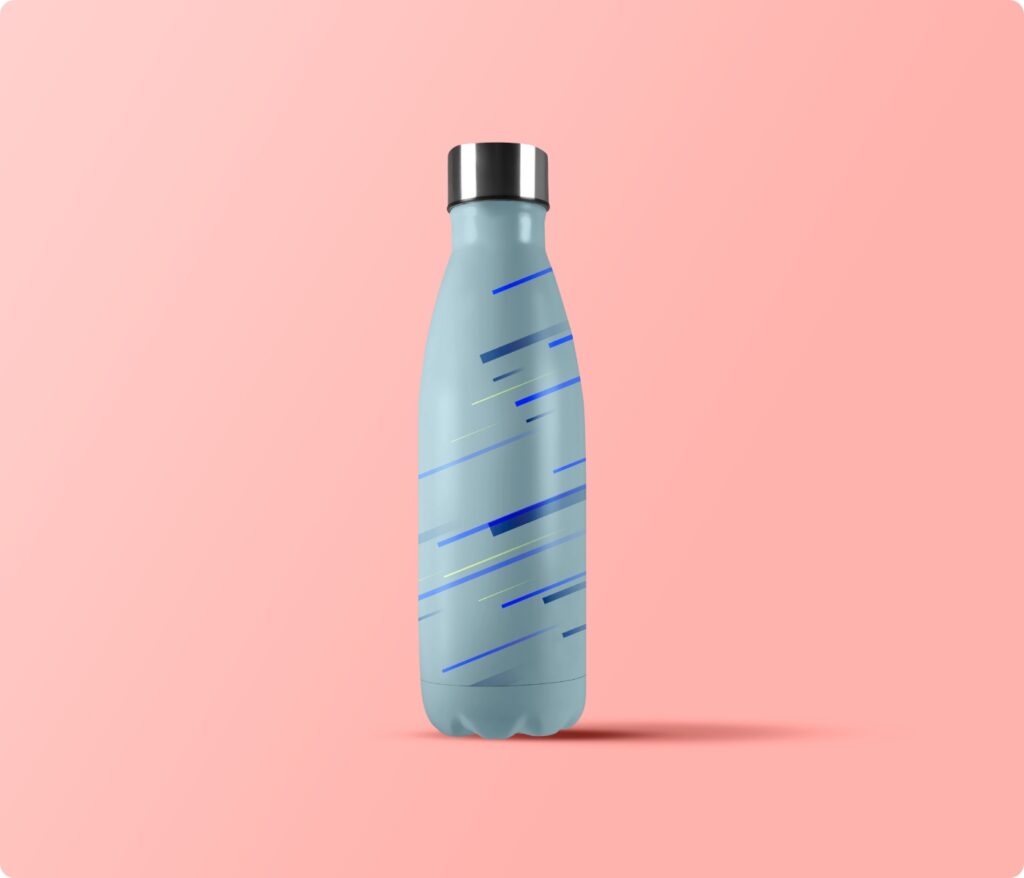
Water bottle
This creates a nice gift, as well as being a useful reusable container. Being so useful, it is a piece of merchandise that will likely stay around for awhile. Keeping the brand front of mind.
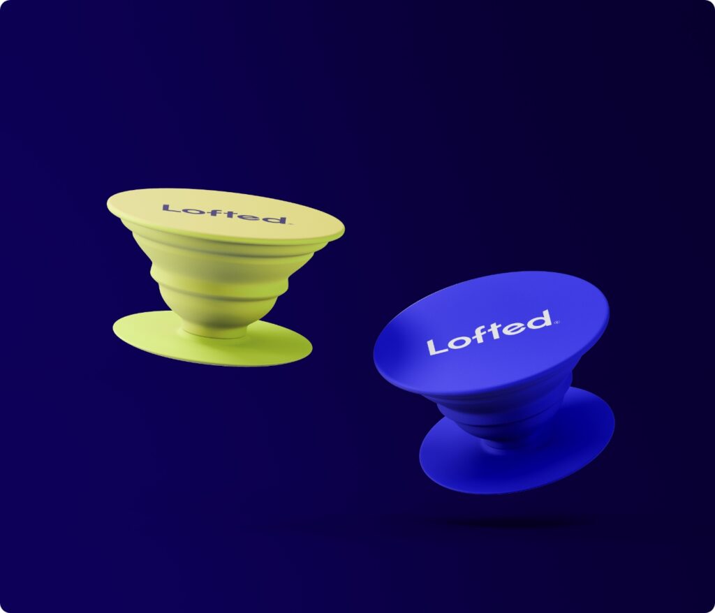
Pop Socket
Pop Sockets are an easy way to increase the ergonomics of using your phone. As Lofted is used predominantly on a mobile device, it made sense for us to provide the user with this option. At the same time promoting the brand.

Outcome
Using targeted research and a complex user focused approach, we have been able to identify and address the pain points that current finance app users are facing. This has allowed us to create a product that users can easily access and use, minimising their admin time and reducing the stress of future planning.
NAMING
MARKET RESEARCH & ANALYSIS
BRAND IDENTITY
UI/UX
ILLUSTRATION


