Liftlab Beauty
Task
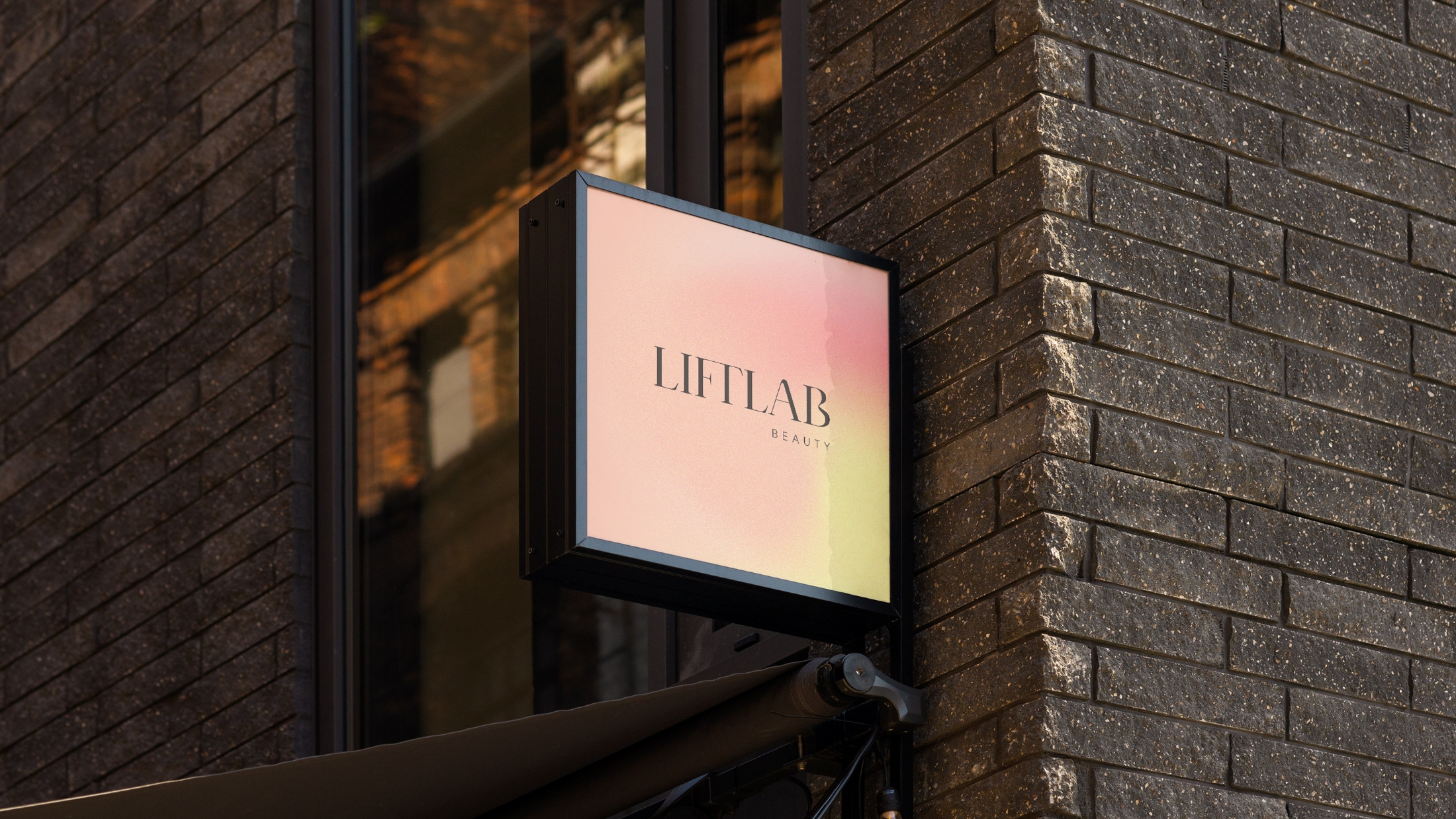
Liftlab Beauty decided to shift their brand style and positioning to better appeal to their new target audience. Their new approach is rooted in the science behind beauty, guiding their products and services.
Journey
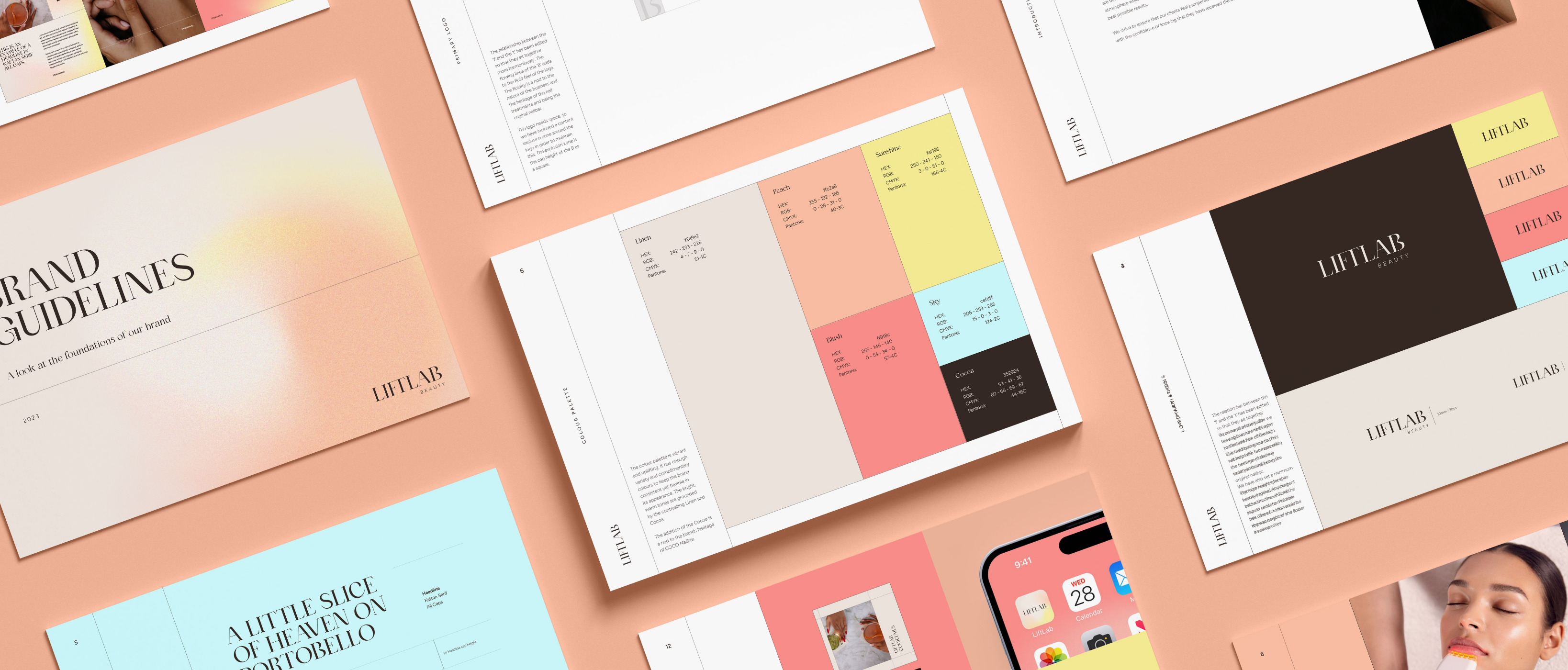
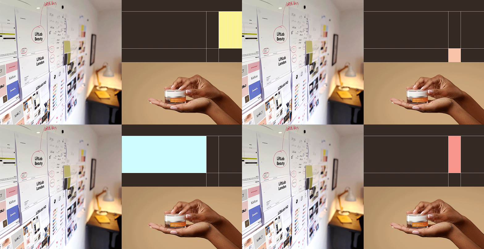
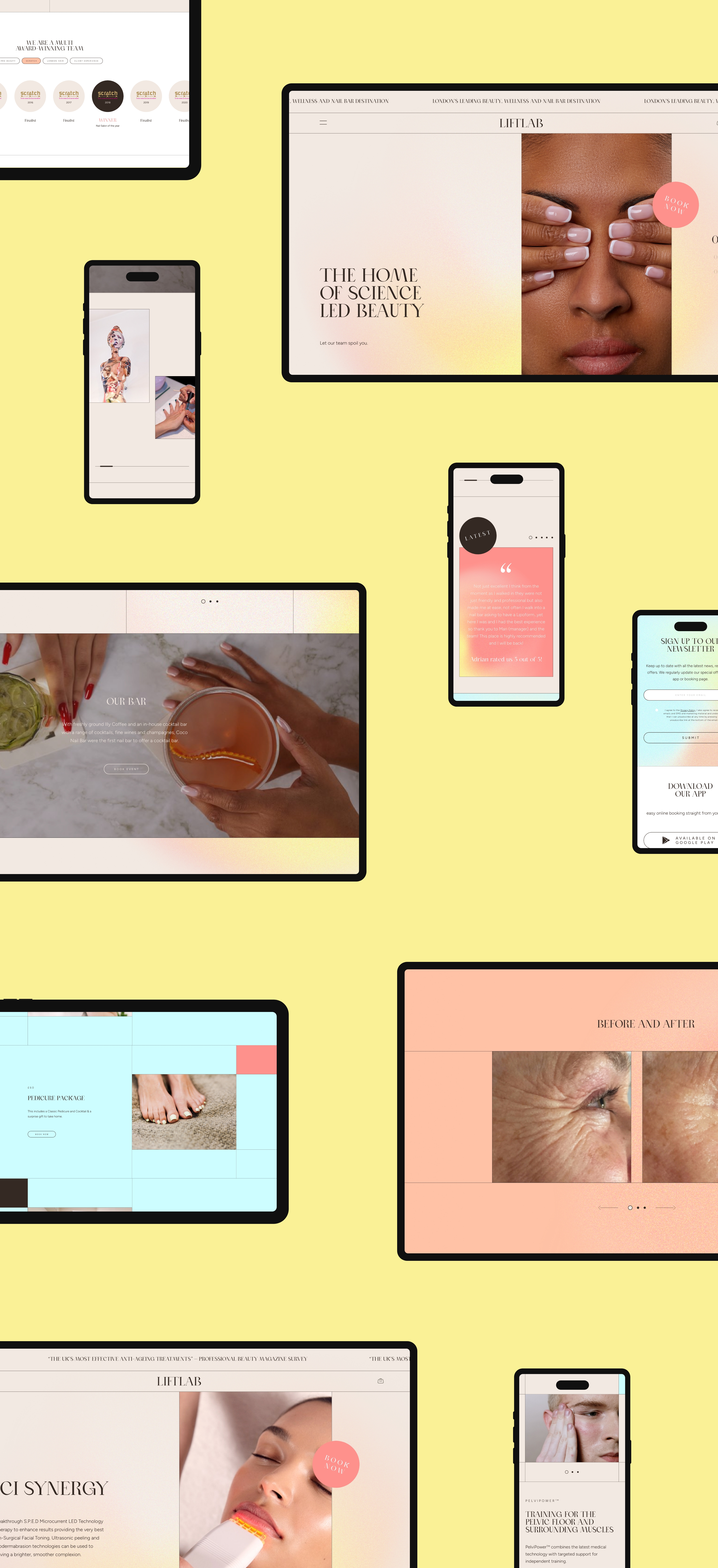
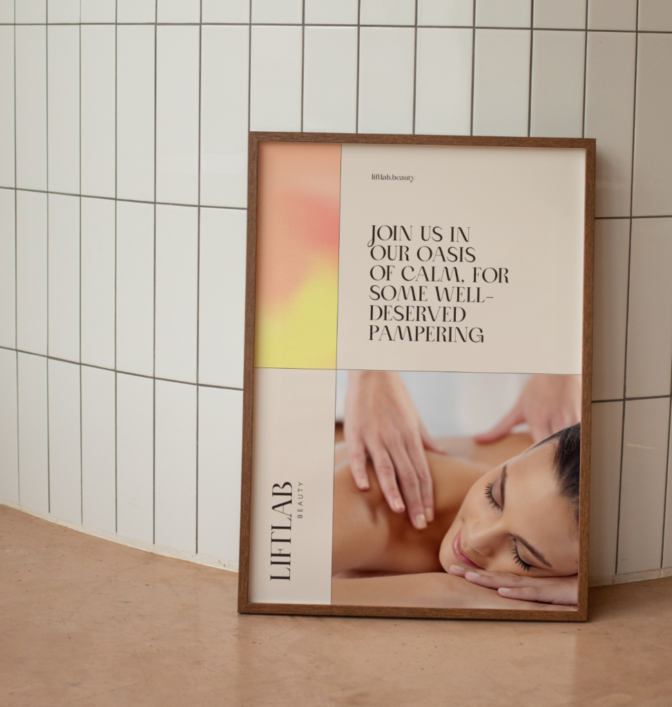
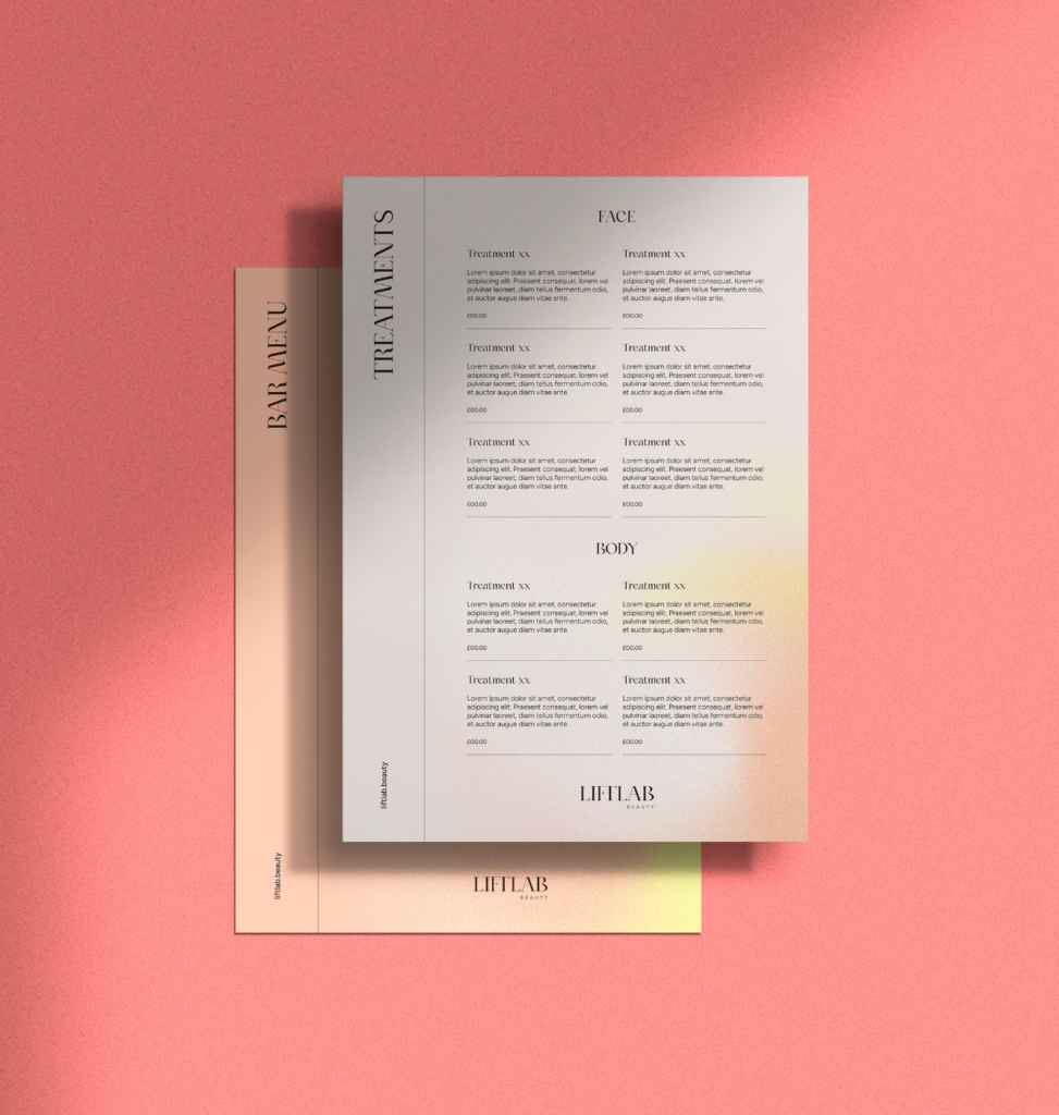
Collaborating with the Liftlab team, we developed a new graphic language and style for their brand.
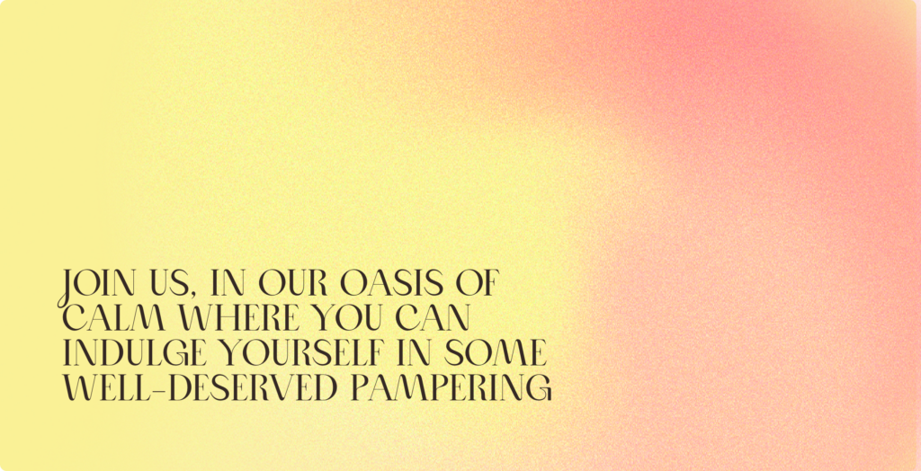
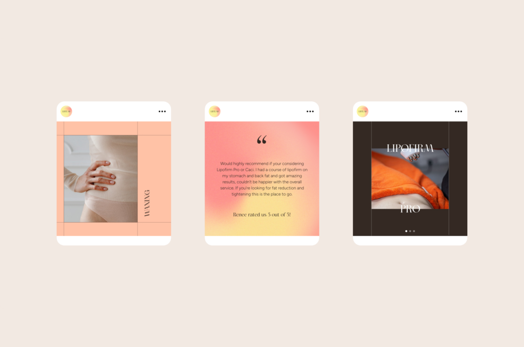
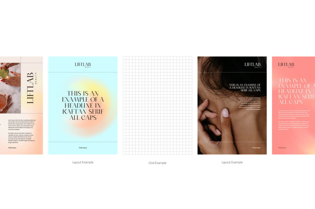
Drawing inspiration from their history as the first nail salon with a bar, we incorporated a ‘spritz’ graphic that pays homage to their roots. Additionally, the graphic’s subtle gradient noise reflects the scientific side of skincare and symbolises the smoothing action of their treatments.
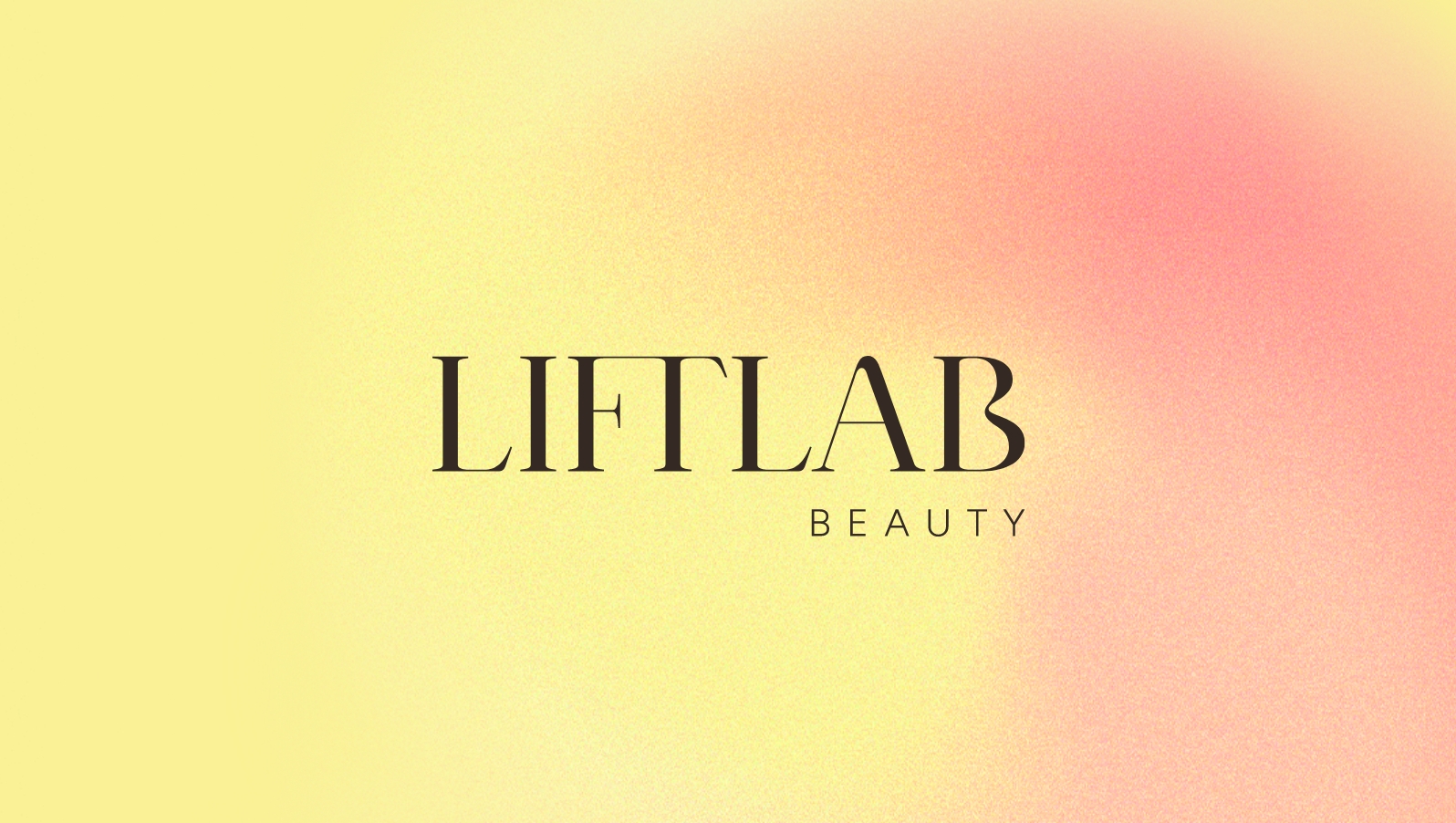 Logo
Logo App Icon
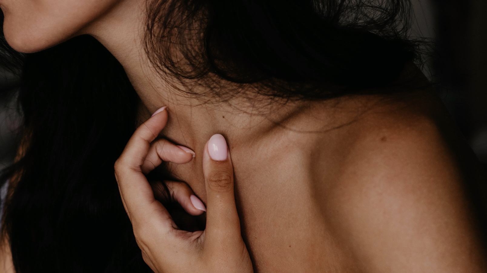 Imagery
 Colour Palette
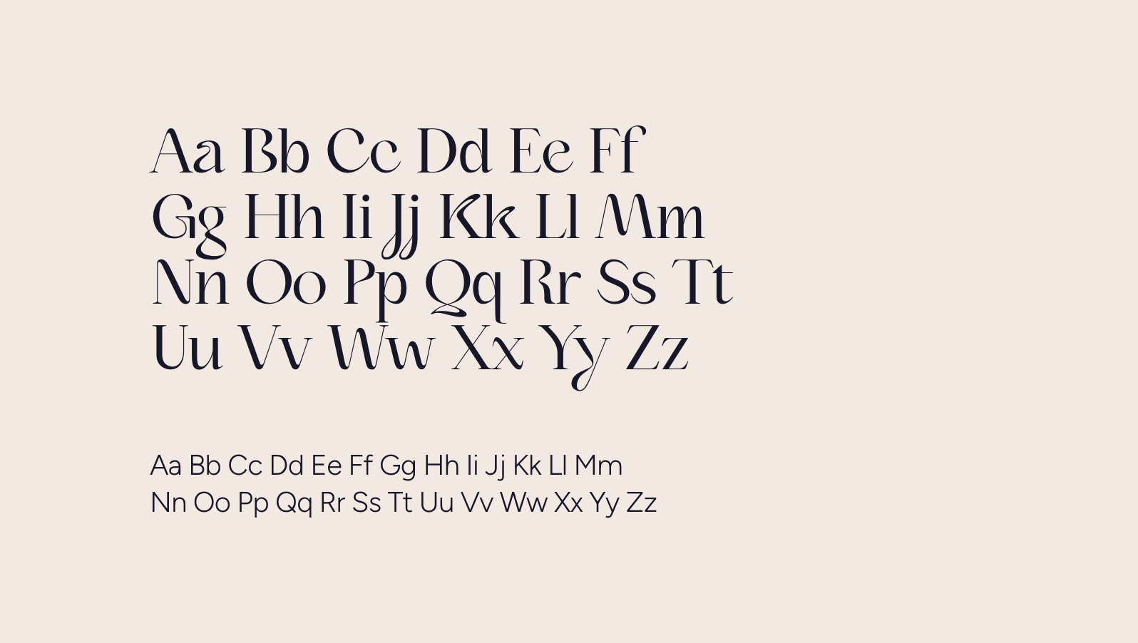 Typography
 'Spritz' Texture
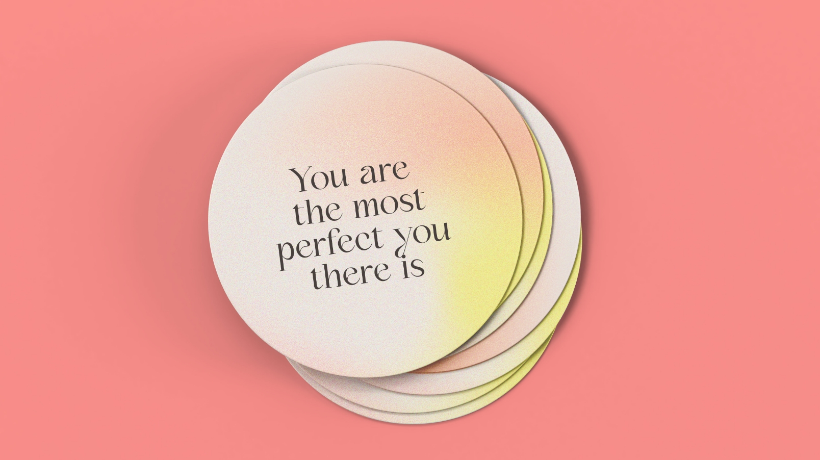 Coaster
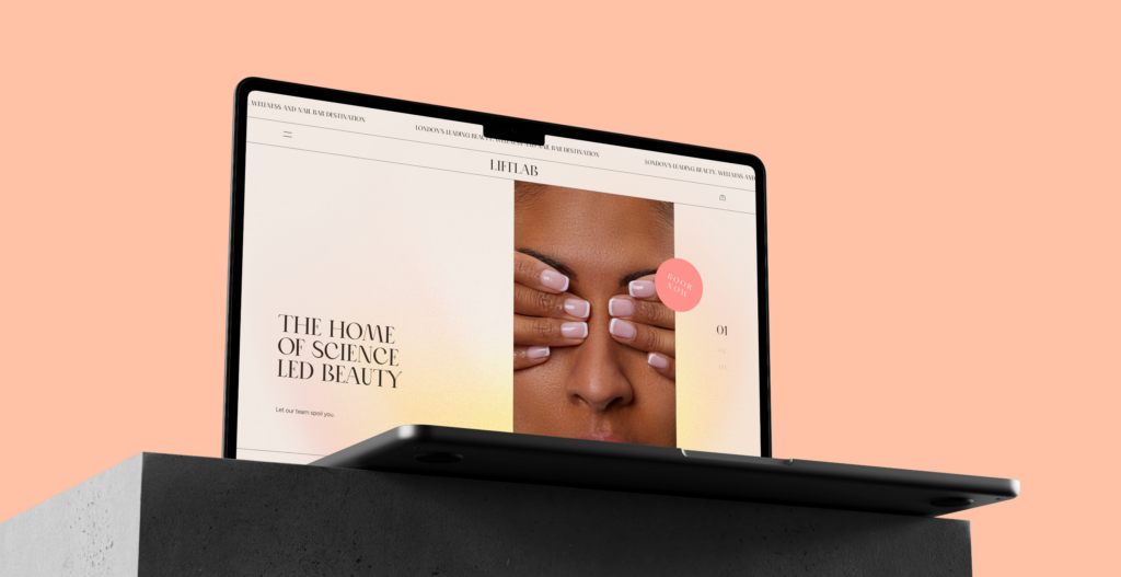
“The brand development process with your team was positive and straightforward. We successfully achieved our vision, well-received by the target audience, though some individuals resist change. Nevertheless, we believe they will come around to the new name. The brand looks great, altering perceptions and attracting more clients for beauty treatments. We definitely recommend working with your team in the future, thanks to the successful collaboration and amazing aftercare.
Tima Reshad, Owner

Packaging
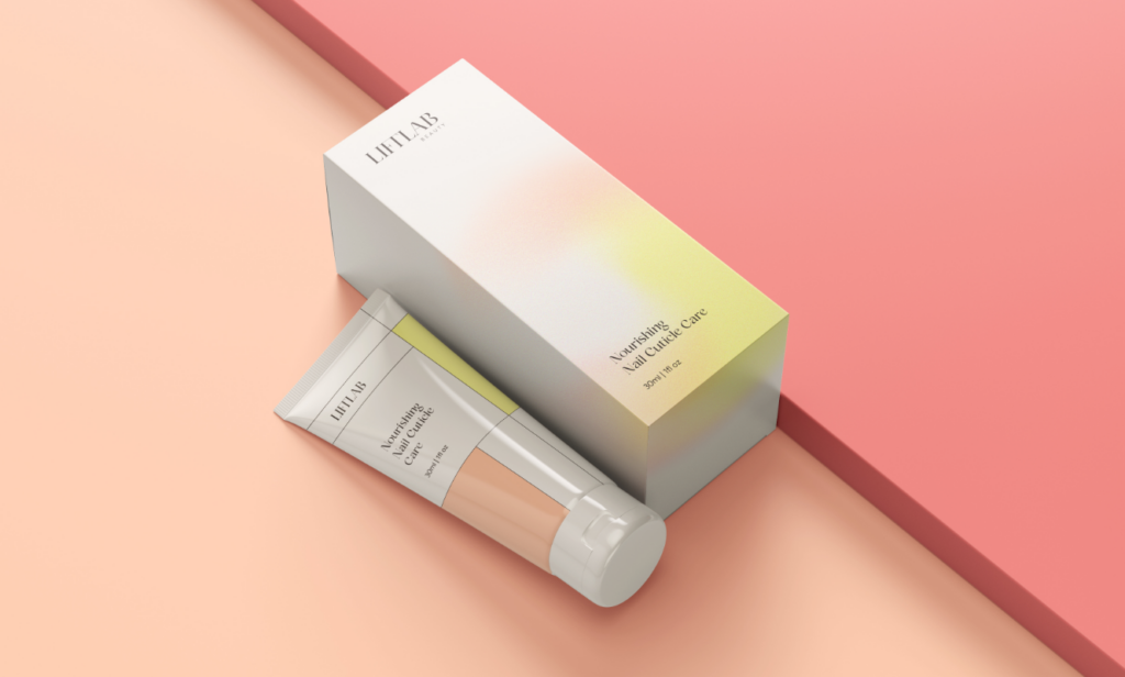
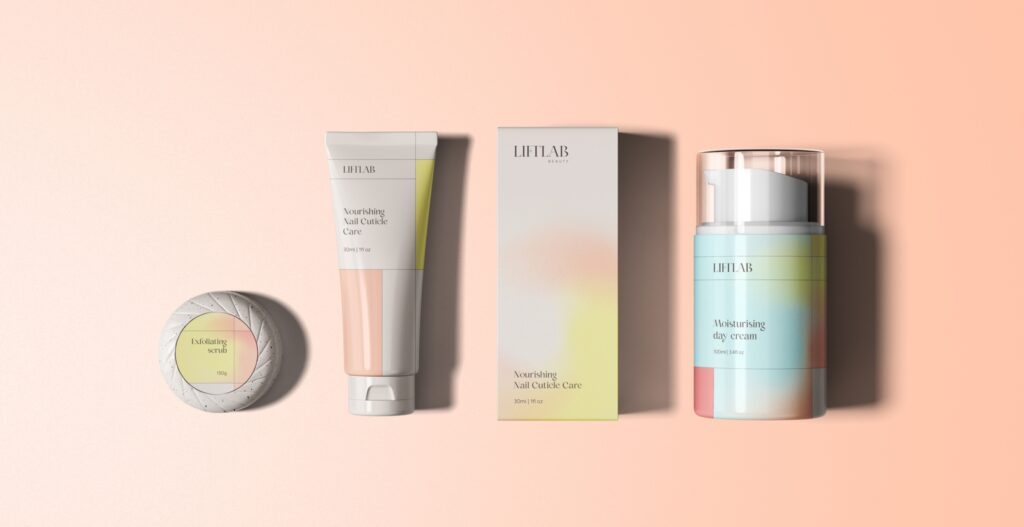
As part of future proofing the Liftlab Beauty brand, we created a series of packaging options. So that if they decided to branch out further into the product market they could do so.
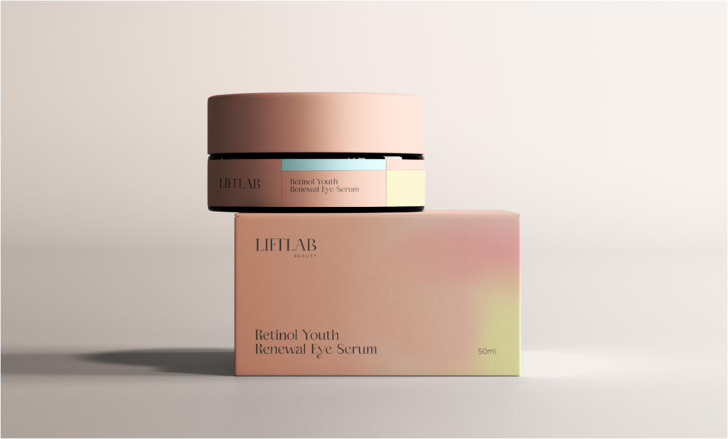
Packaging
As part of future proofing the Liftlab Beauty brand, we created a series of packaging options. So that if they decided to branch out further into the product market they could do so.
Outcome
Liftlab Beauty really is the spot to indulge in some science-led pampering. They have successfully shifted their branding and positioning to better connect with their target audience through a new approach focused on the science behind beauty.
BRAND POSITIONING
VISUAL IDENTITY
PACKAGING DESIGN
UI/UX
WEB DEVELOPMENT
SOCIAL MEDIA


