The Great Simplification
Task
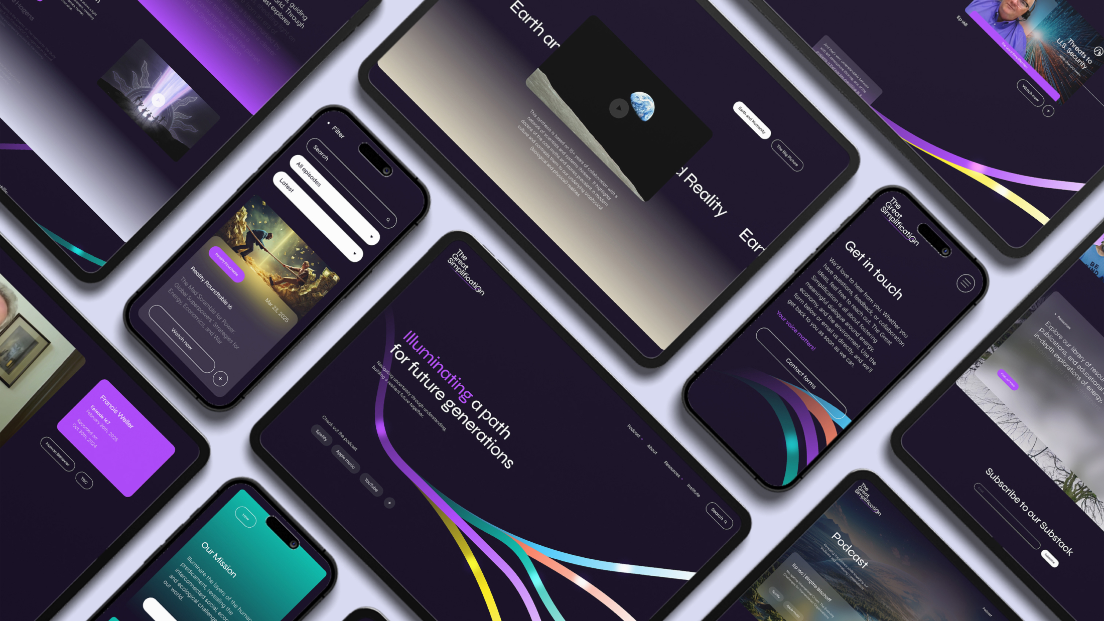
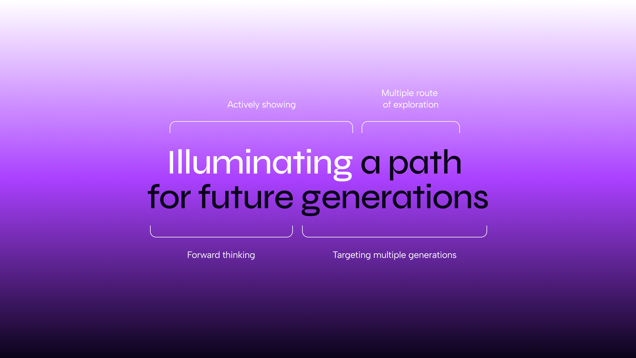
The Great Simplification is a sensemaking platform that approaches the complexities of our world with curiosity and honesty. Our role was to evolve this platform, both visually and tonally, in a way that broadens its appeal without losing the essence that resonates with its current audience. By aligning closely with the core ethos of TGS, we were able to chart a thoughtful path forward that balances the need for modernisation and clarity while remaining accessible across generations.
Journey
The platform was already established and performing well, so our focus was on maintaining that momentum. Rather than reinventing the wheel, our goal was to refine the brand’s narrative. We approached this by drawing attention to the brand’s inspiration and the themes that shaped its vision. One of the key concepts was “The Carbon Pulse.”
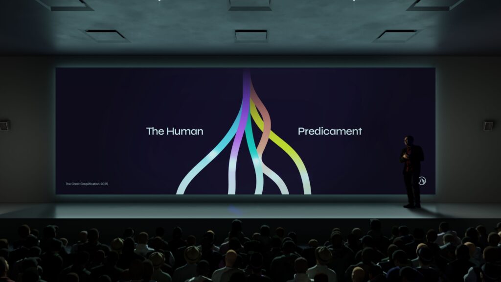
After several rounds of iteration, it became clear that this idea should form the foundation of the new logo. We set out to create a responsive and dynamic design where this concept played a central role.
A distinctive element of the logo is the mark showing multiple lines descending from the peak of the pulse. These lines remain contained within the outer edges of the symbol, representing the uncertainty of the carbon pulse’s downturn and the possibility of multiple outcomes.
 Logo Iterations
 Messaging
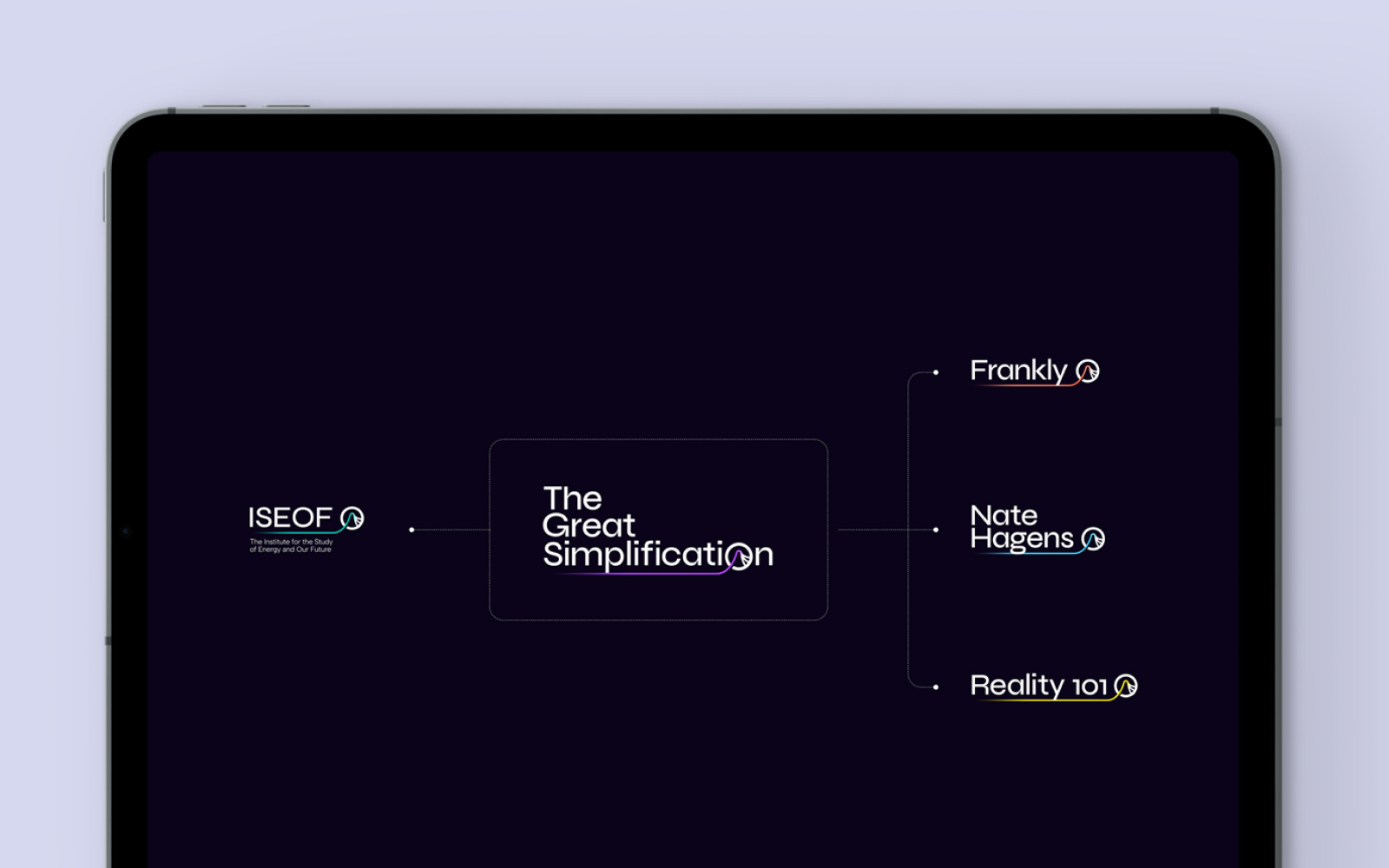 Brand Architecture
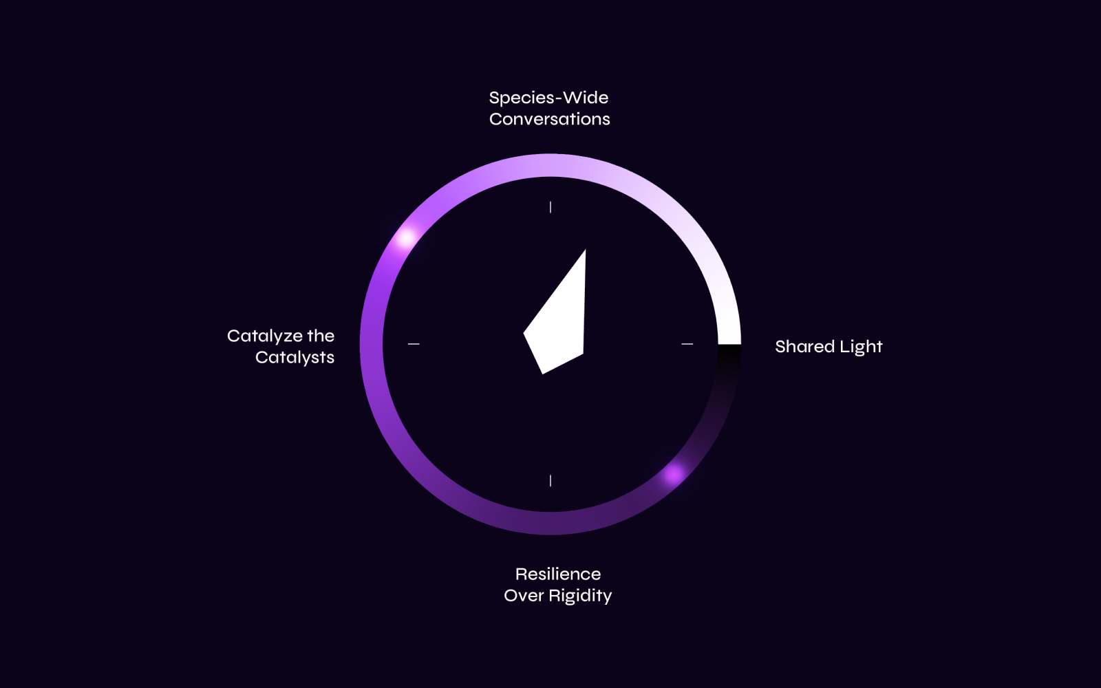 Guiding Principles
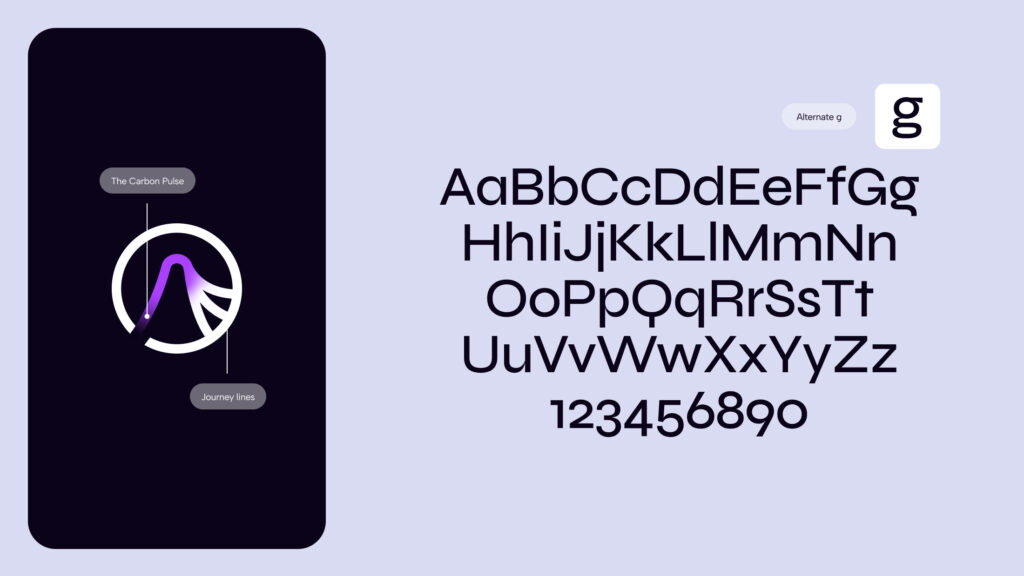
Journey lines
The visual language emphasises depth and the dynamic, ever-evolving nature of the brand. Each form represents a member of the TGS community and is a metaphor for their individual journey. These journey lines can adapt and grow over time, mirroring the resilience and progression of the TGS community.
Misty Stinnett | Director of Content, The Great Simplification
“It has been phenomenal working with you on this, Brad, Aaron, and Kait! So many times throughout this process I’ve thought, “thank goodness we chose Fairground as our partner.” If anyone is looking for the right agency for a re-brand, website build, strategy, messaging, etc – look no further. The Fairground team is IT!”

Icons
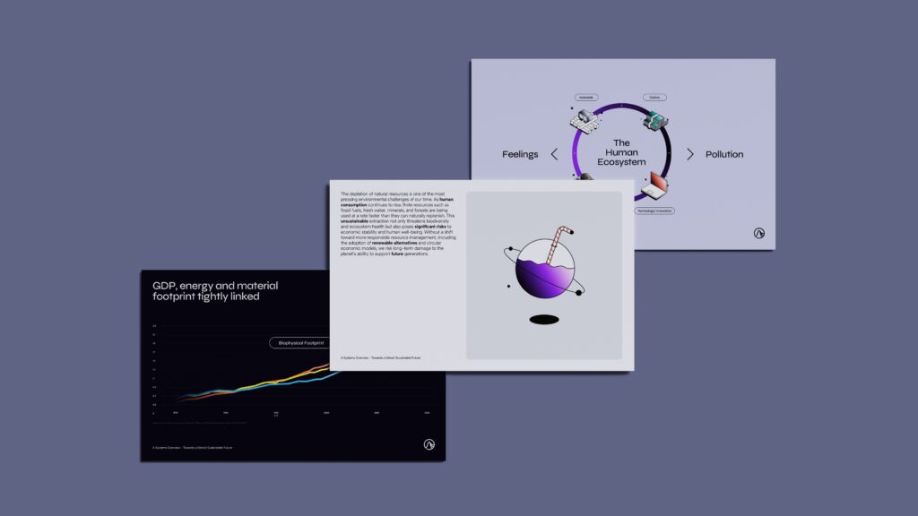
The TGS brand utilises an illustrative icon style, this helps to maintain brand consistency in presentation. Throughout the presentation, real-world imagery can feel a bit less effective when conveying a complex message, whereas illustrations can communicate ideas more clearly.
Outcome
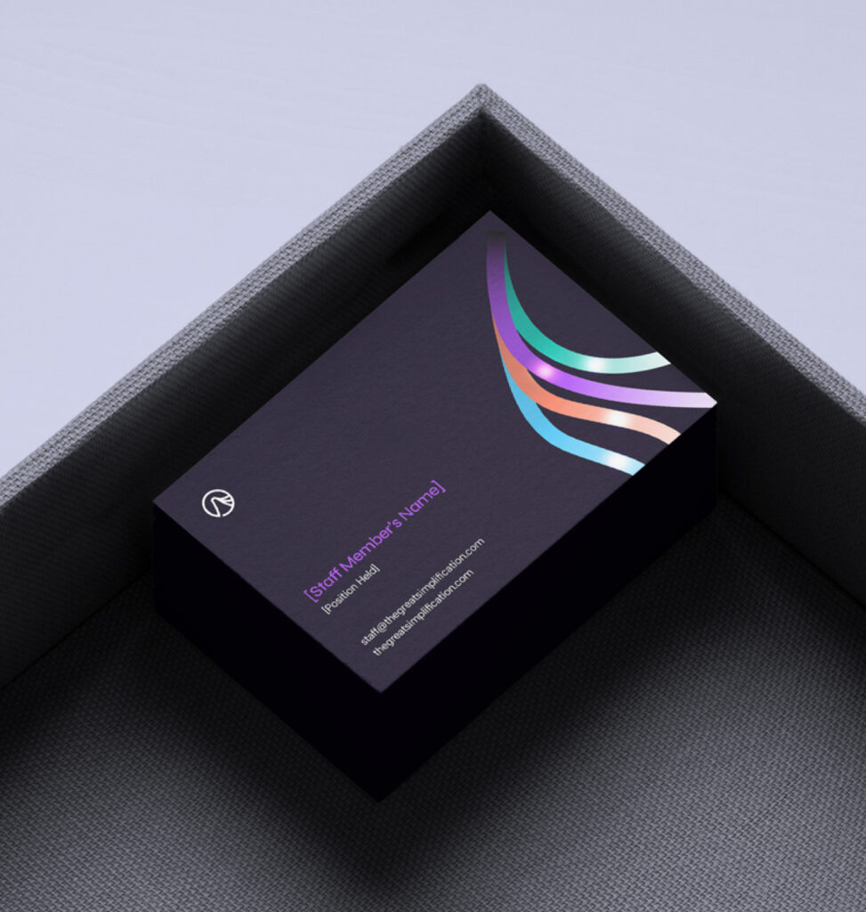
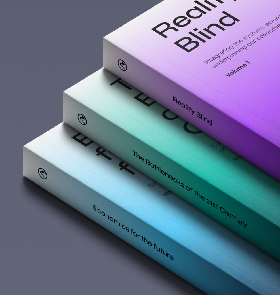
The brand lacked consistency across its touch-points, both online and offline. We addressed this by developing a cohesive design system that unified the existing websites and assets into a single, well-structured brand foundation. By refining the brand’s messaging and narrative, we provided the audience with clear, accessible resources which created a deeper understanding of The Great Simplification and their vision for the future.
STRATEGY
BRAND POSITIONING
MESSAGING
BRAND DEVELOPMENT
WEB DESIGN
WEB DEVELOPMENT
SOCIAL