The Grewery
Task
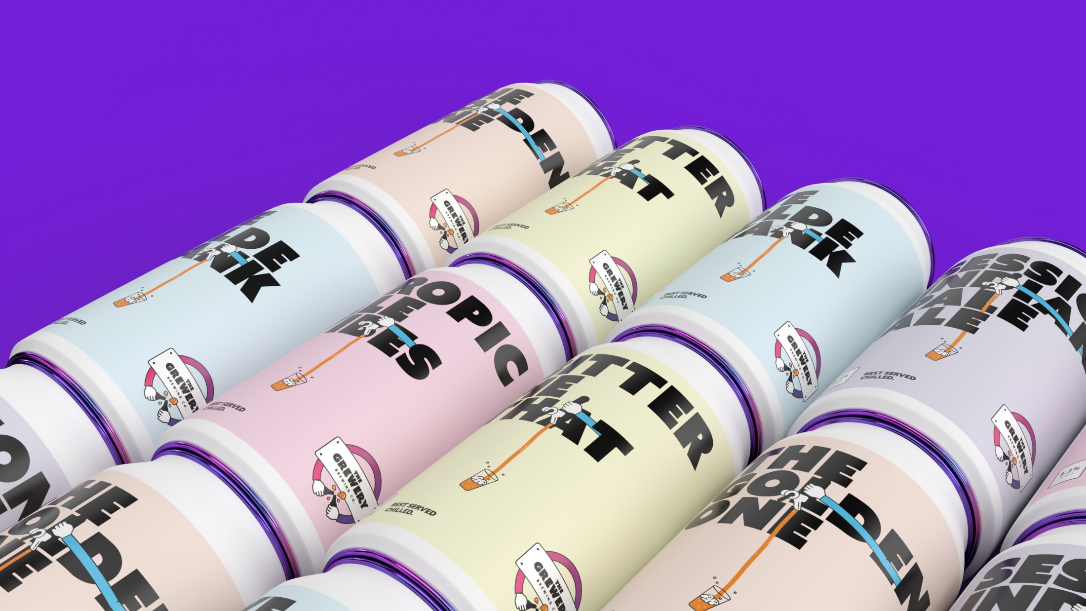
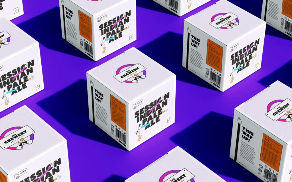
To create a beer that can be enjoyed by anyone, anywhere. A product that can seamlessly fit in, whether that be in a supermarket setting or a farm shop.
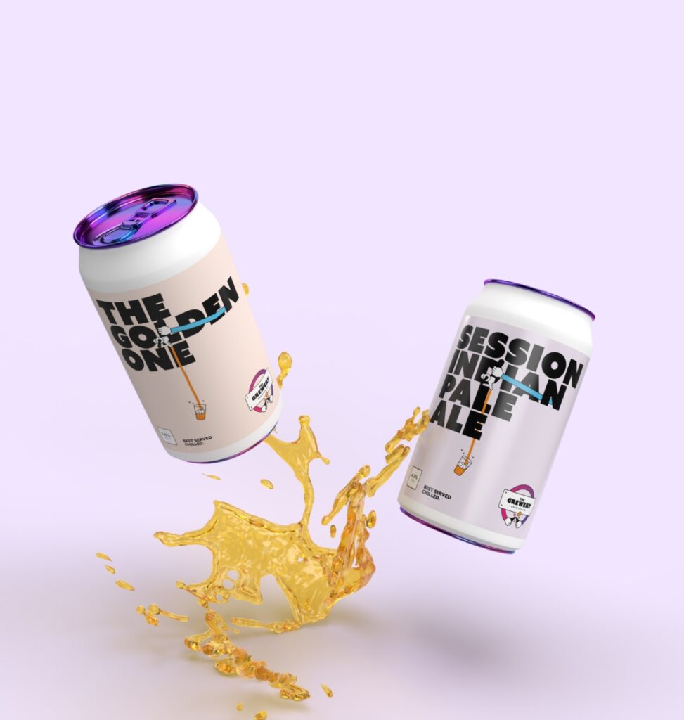
The design takes no prisoners and is a punchy statement that the product is something to shout about.
Journey
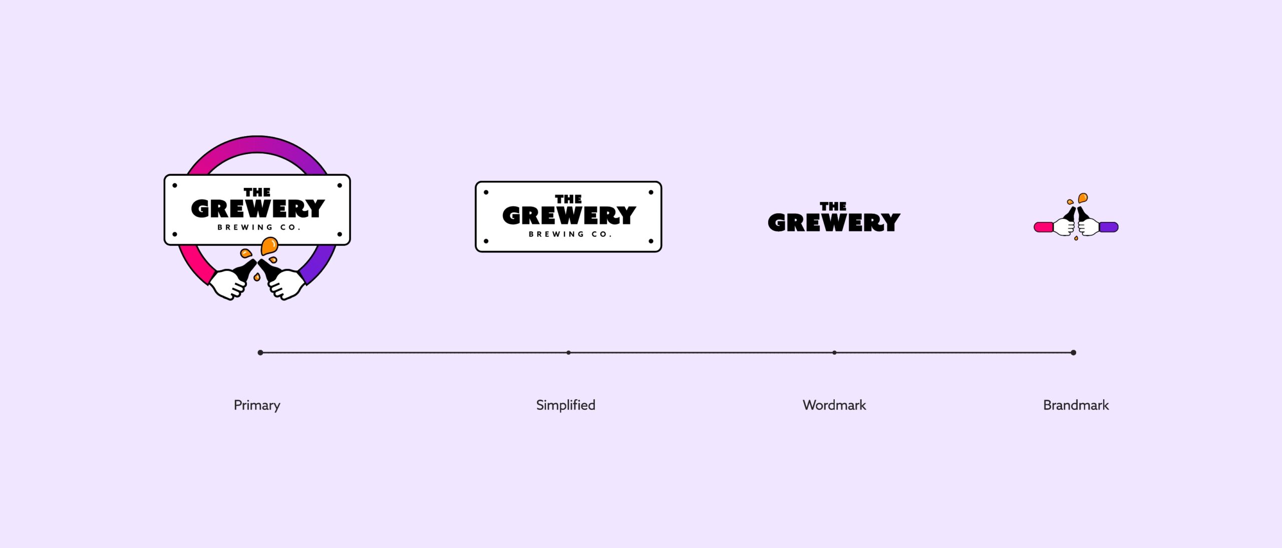
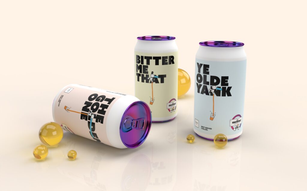
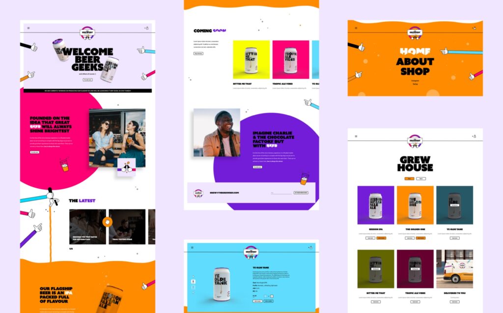
Taking the idea that great beer will always shine brightest this is injected throughout the brand in its bold and colourful execution. We really wanted this brand to be playful and that is shown in its punchy typography and illustration style. The name not so cleverly is a play on our family name Grew and brewery, it was fate. Difficult to say but easy to remember.
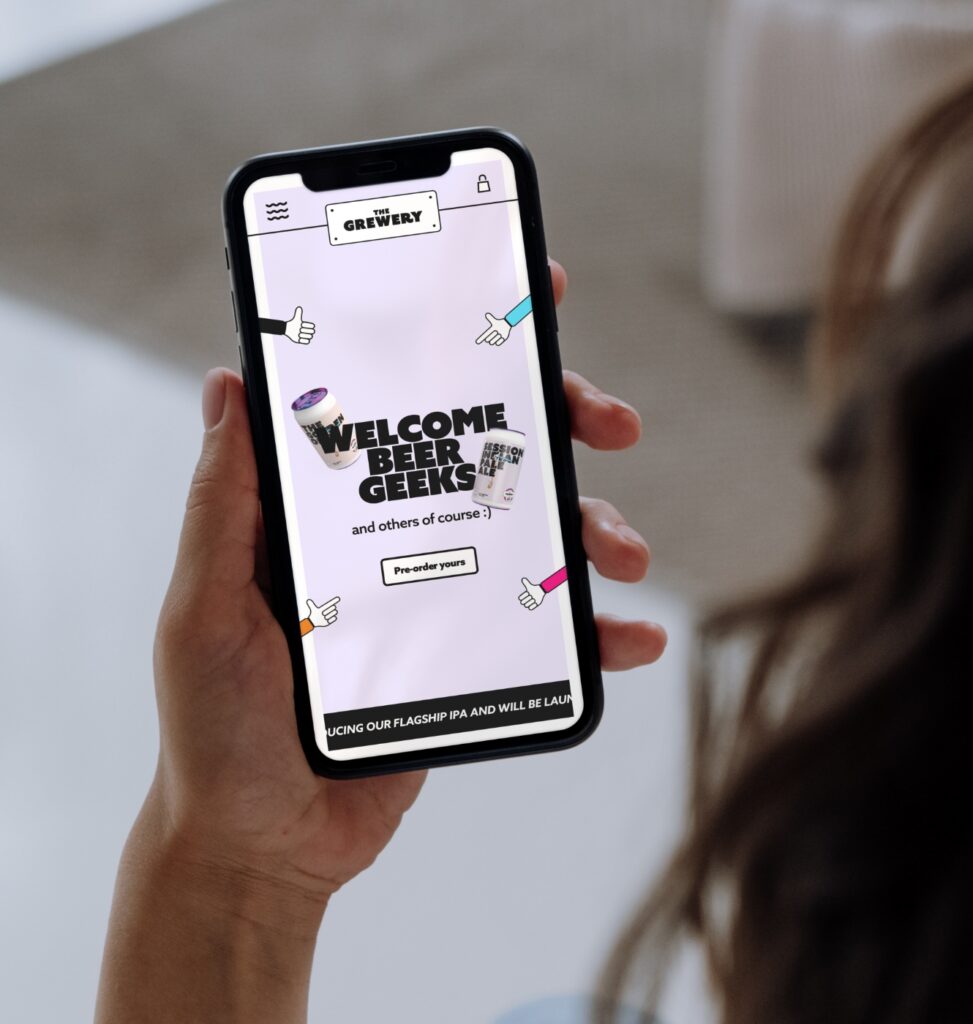
We have carried this playfulness across into the tone of the copy in the naming of the products and within the digital assets.
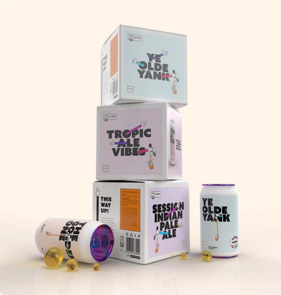
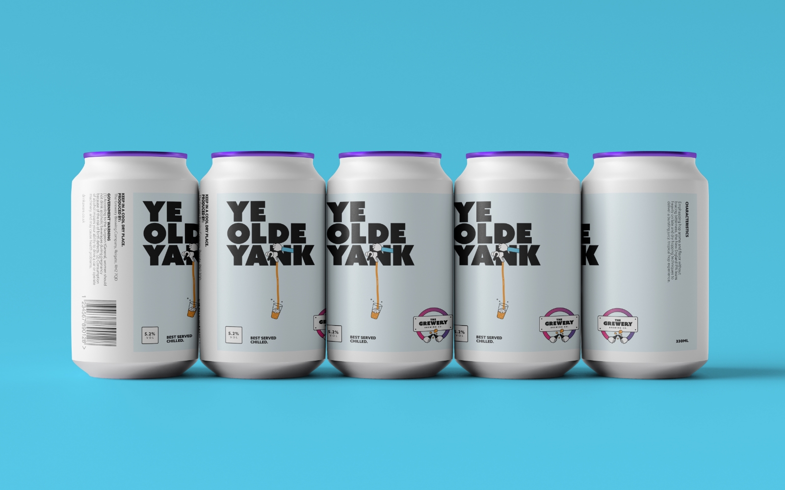 Ye Olde Yank
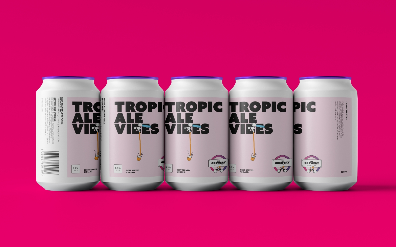 Tropicale Vibes
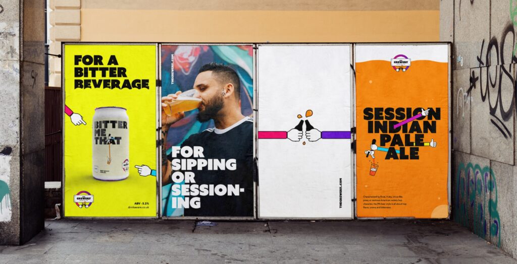
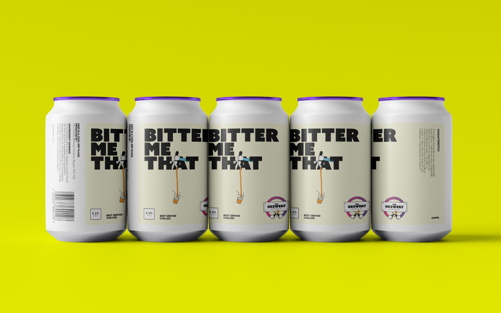 Bitter Me That
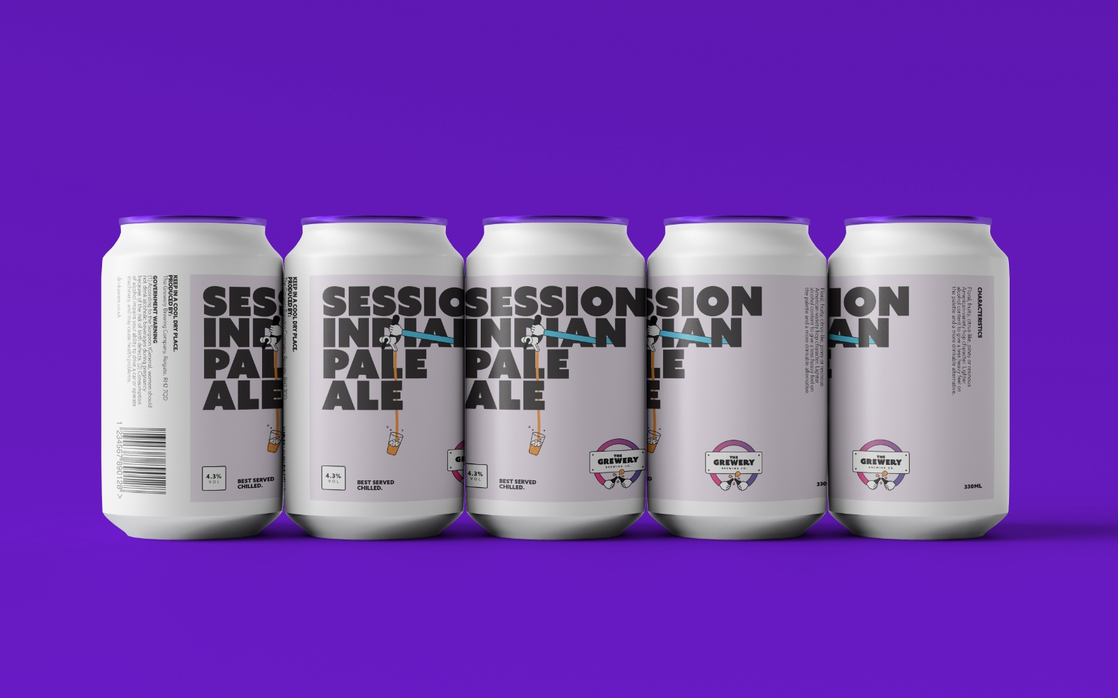 Session IPA
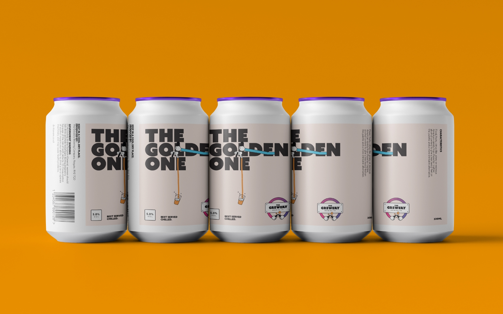 The Golden One
“ The new identity encompasses all of the attributes that we were trying to instill in the brand. It is playful without being too out there, inviting and inclusive. This is a brand that everyone can enjoy, whilst also appreciating a great product.
Signage
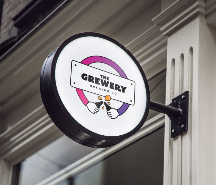
As part of the project scope we created a signage system, which included everything from front of house to wayfinding in the brewery itself.
Pins
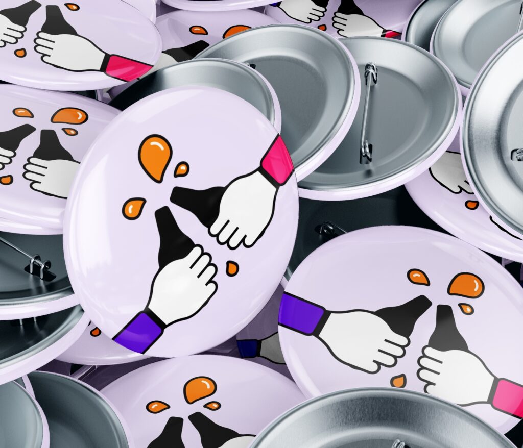
To spread the word and love, we created some custom merchandise. This included these awesome pins that can be attached to clothing and bags.
Illustration
The illustration style is simple and emotive and is inspired by the London Underground tube map. The exaggerated arm lengths accentuate the social aspect of the brand.
Outcome
The new identity encompasses all of the attributes that we were trying to instill in the brand. It is playful without being too out there, inviting and inclusive. This is a brand that everyone can enjoy, whilst also appreciating a great product.
BRAND IDENTITY
PACKAGING DESIGN
UI/UX
ADVERTISING
SOCIAL ASSETS
SIGNAGE


