Fairground
Task
Journey
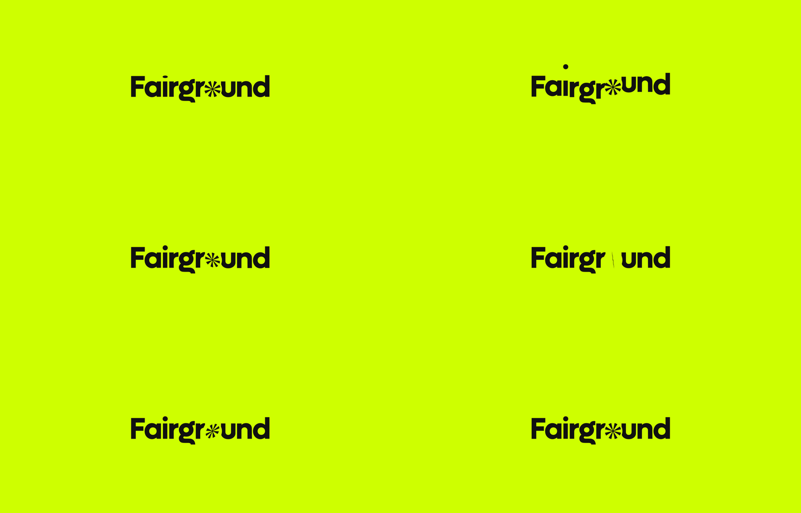
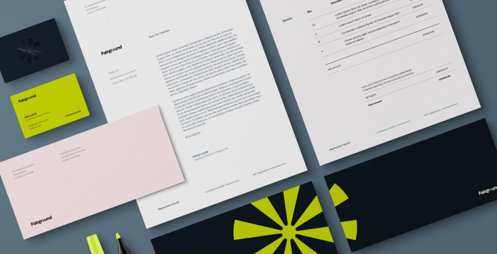
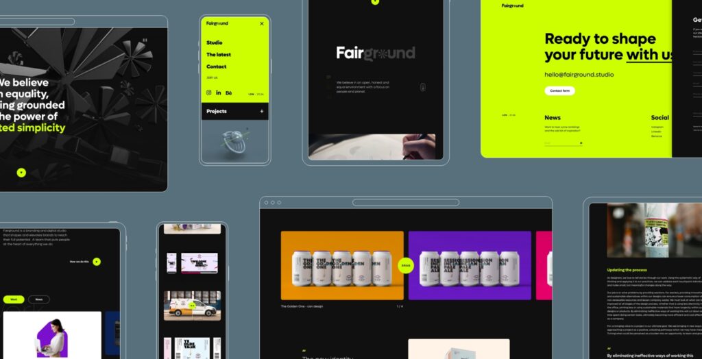
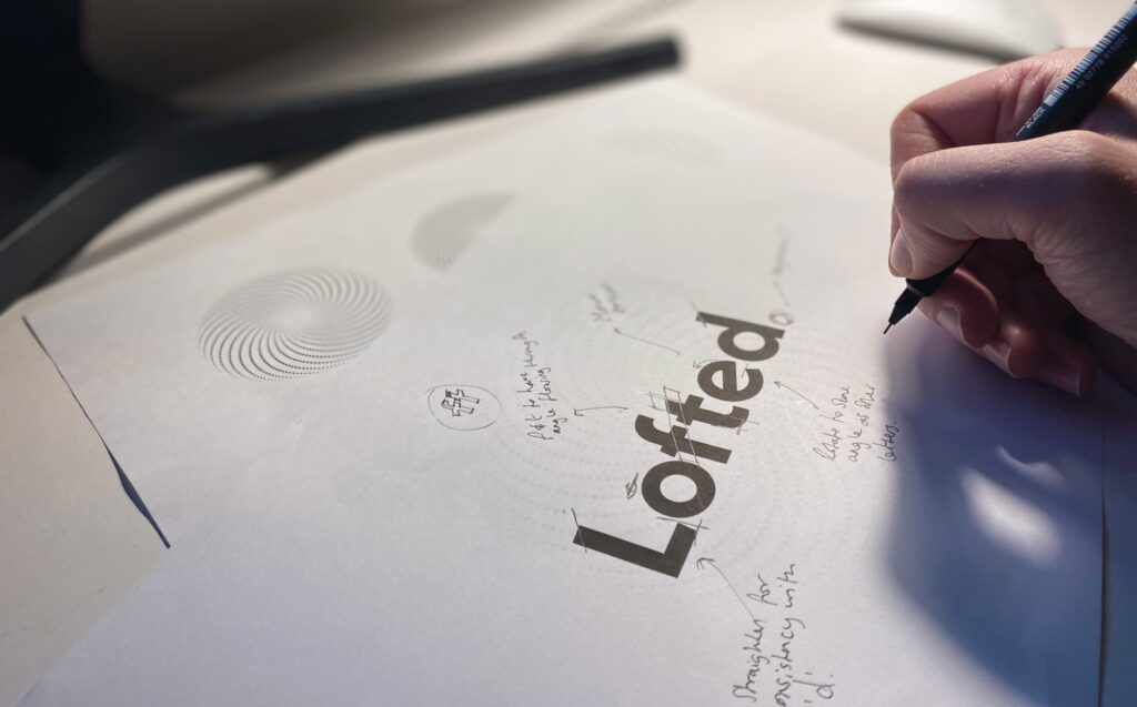
Each element of our brand has been carefully considered. For example the font Lufga is our brand font because it has crisp clean lines and has just enough playfulness in some of its forms, particularly the letter ‘g’. Our brand mark was inspired by a big-top tent, carousels and the ferris wheel. These rides and attractions give our brandmark its personality and flexibility, especially when in motion. Our colour palette represents our personalities; bold, ambitious and vibrant with a neutral grounding backdrop.
 Brandmark
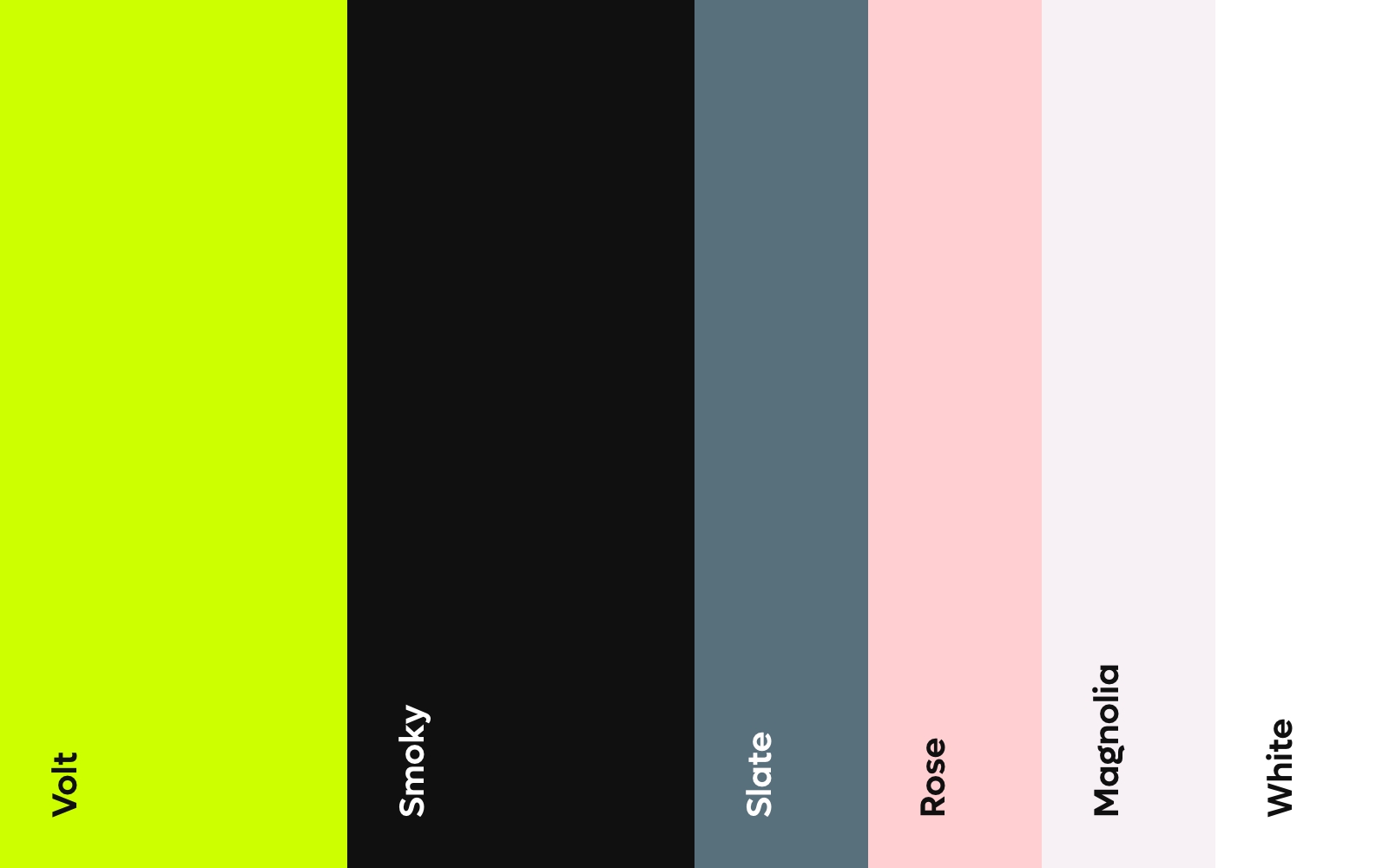 Colour Palette
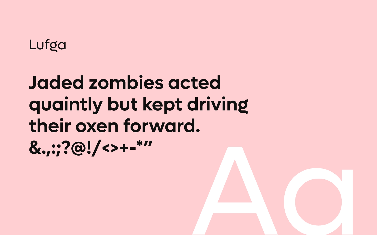 Typography
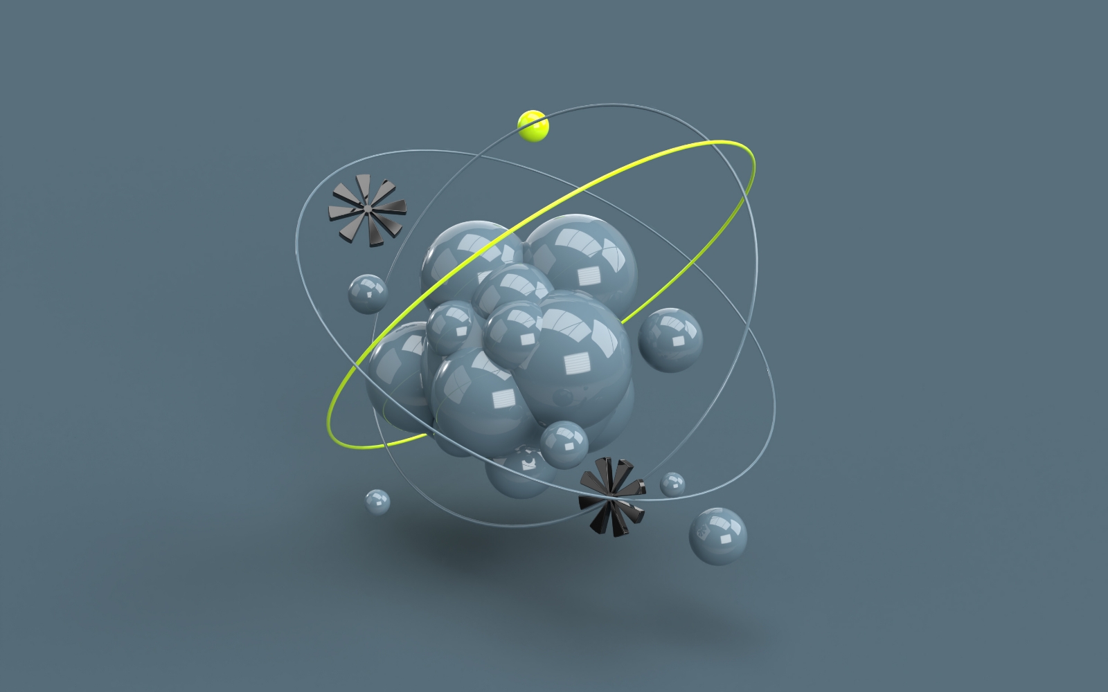
 3D Assets
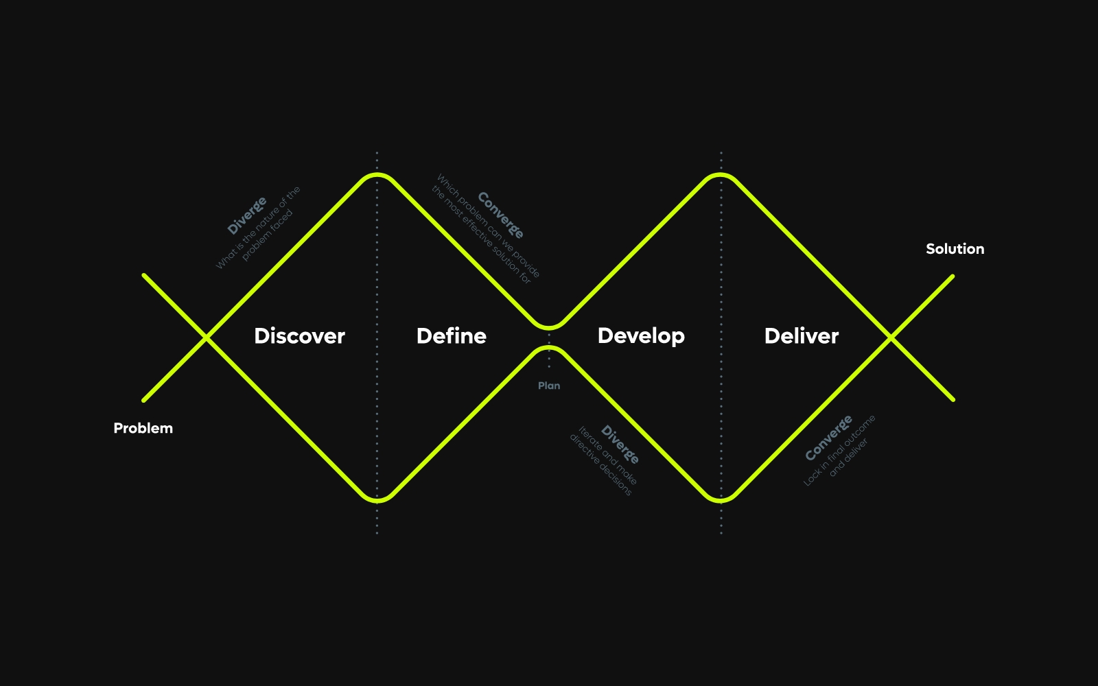 Infographic Style
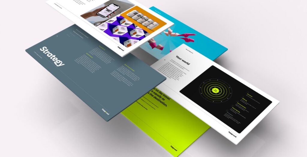
“For us it is as much about the BIG picture as it is the finishing touches. We are deeply passionate about providing our clients with real value.
Brand assets
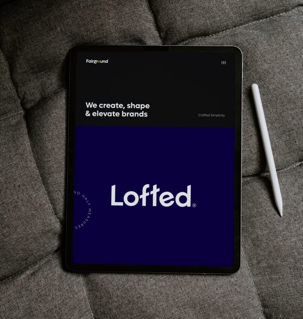
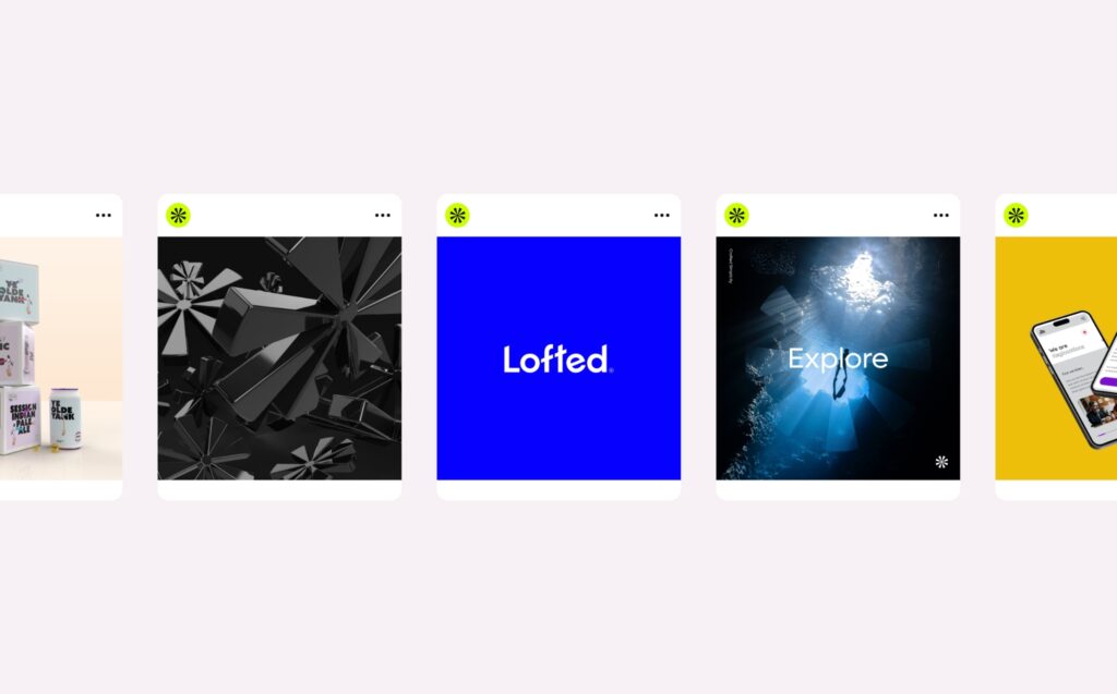
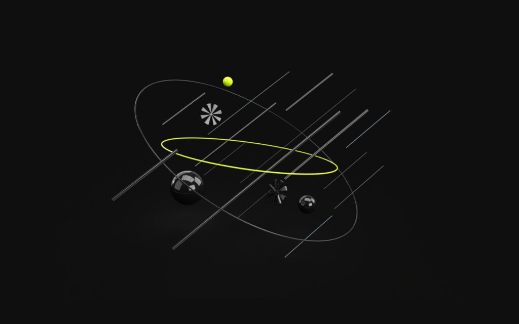
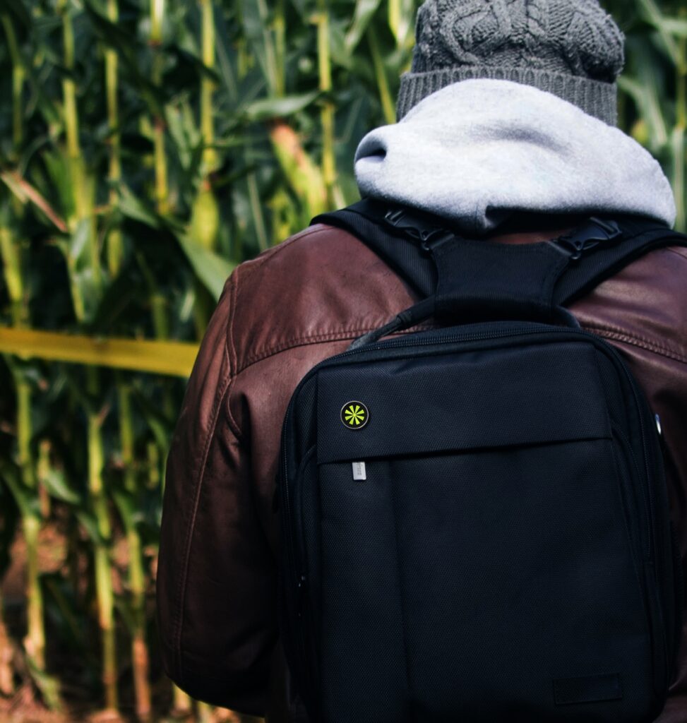
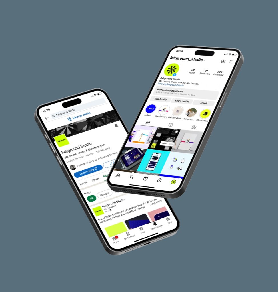
As we would for our clients, we have created distinctive brand assets. As designers we love to tell stories and these assets will help to visualise this in a more engaging way.
Brand assets
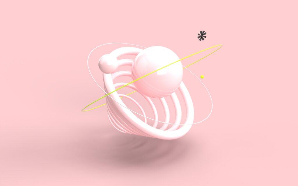
As we would for our clients, we have created distinctive brand assets. As designers we love to tell stories and these assets will help to visualise this in a more engaging way.
Brand assets
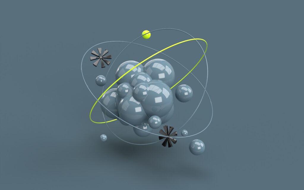
As we would for our clients, we have created distinctive brand assets. As designers we love to tell stories and these assets will help to visualise this in a more engaging way.
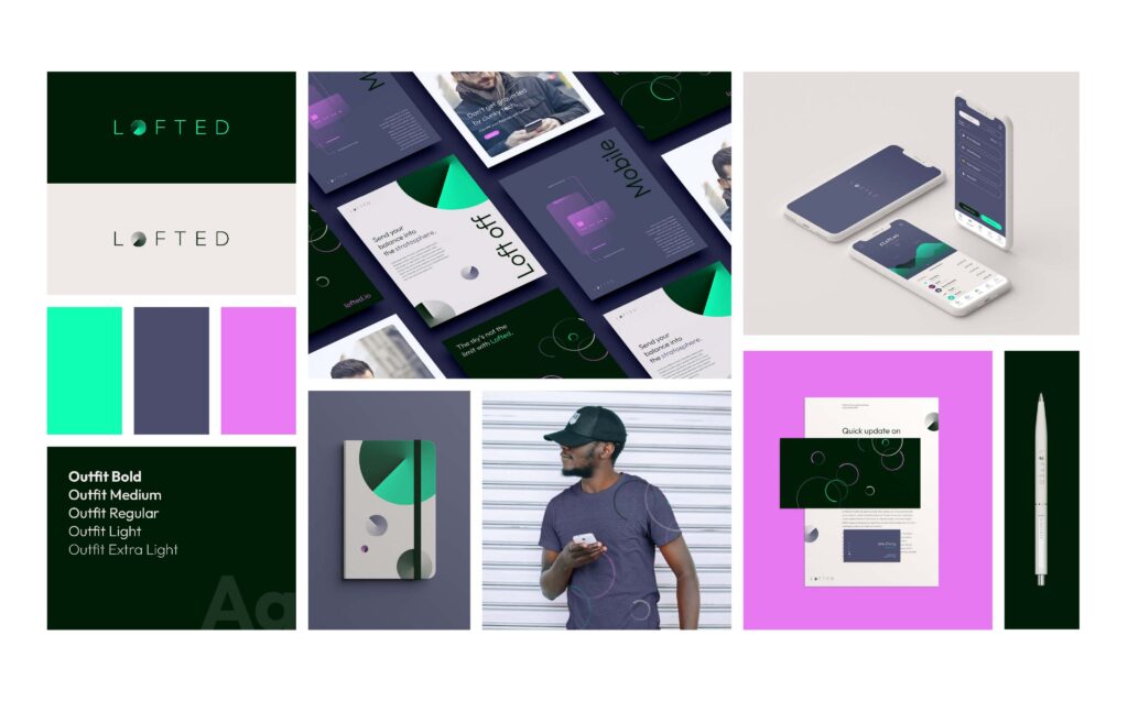
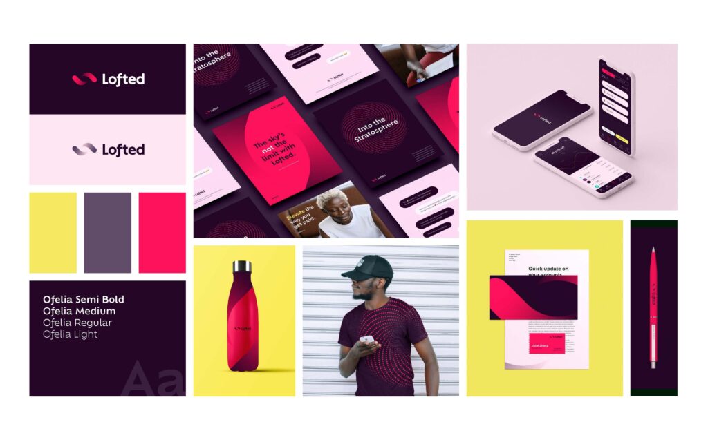
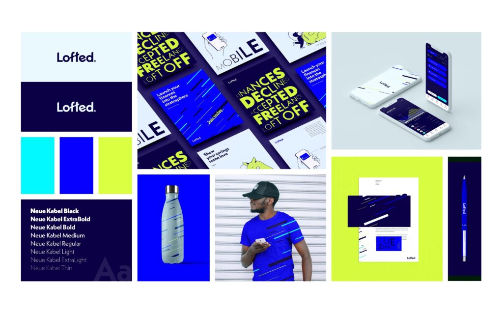
Outcome
BRAND IDENTITY
UI/UX
SOCIAL ASSETS
ADVERTISING


